Can design contribute to healing? Definitely, yes. Pure elegance isn’t able to cure diseases, but smart design and a relevant story behind it can enhance healing capacity of an object that isn’t originally created with therapeutic purposes in mind. While sensor-based tech dominates the industry of smart FMCG, traditional design still plays an important role here. The article outlines latest every-day products that help users improve their well-being indirectly through smart design.
Even a simple pattern may become a game-changer, and sometimes a slight shape transformation may be able to boost the item’s hidden therapeutic potential. In both cases, the object remains the same (or almost the same) and can be used by any other customer without any health-related problems.
Witty kits pre-made for various purposes
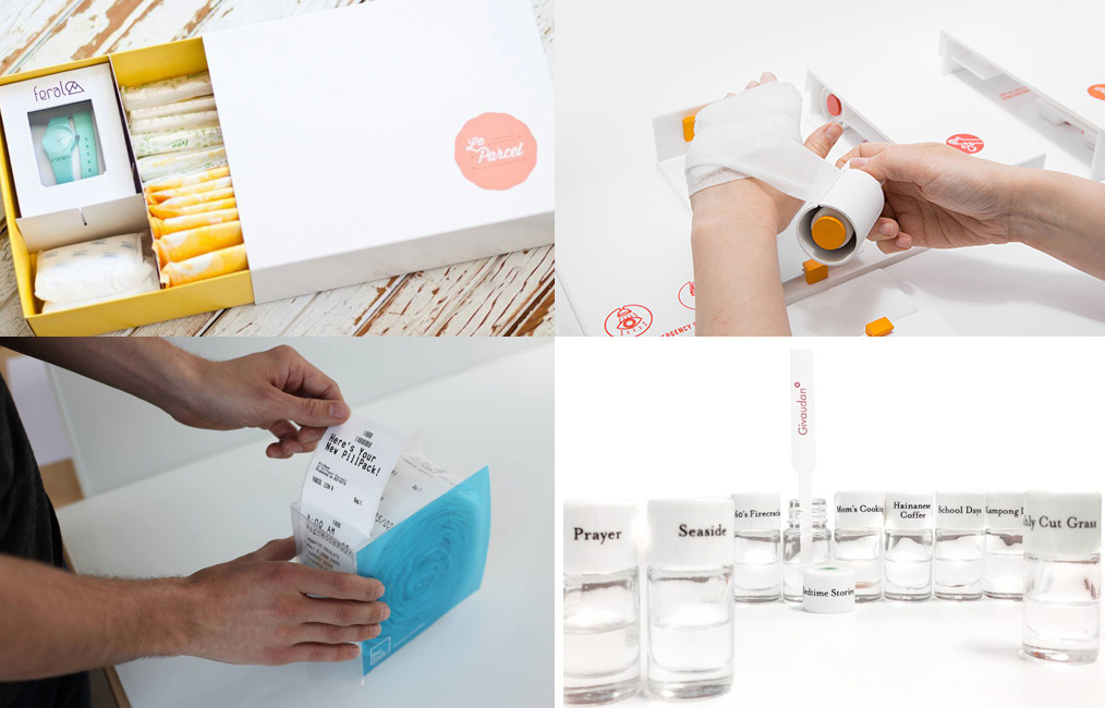
Viewed separately, the items from kits and subscription boxes are quite ordinary, but together they might be a handy tool in a range of life situations. It is the kits’ arrangement and design, not the contents’ individual look that makes these kits stand out.

Subscription box services offer a pack of goodies that help consumers feel better when they are in the middle of a crisis. For instance, the Le Parcel service allows women to sign up for a monthly delivery of a box containing pads and tampons, chocolate, gift and a sweet treat. Women can indicate the brand and number (up to 30) of feminine hygiene products and also schedule the shipment. Currently, there are a plethora of businesses that use this approach, offering various kits for kids, book lovers, fashionistas, gourmands, organic food fans, and many more.
While subscription goody boxes are rather for pleasure than for practical purposes, new generation of medical kits can serve both. The Home First Aid Kit designed by Gabriele Meldaikyte is designed in a way to let a person with minor injuries like burns, scratches and deep cuts use the kits’ contains on his or her own, using just one hand. So, even if the accident happened when the person was alone, he or she will be able to treat the injury fast and effectively.
A huge number of people take several prescription medications at a time, and they definitely need to have their pills and regimes managed and organized in a simple way. The recently launched U.S. PillPack online pharmacy delivers medication cocktails, pre-sorted into a personalized dispenser, every two weeks. The tear-off dose packets featuring the day, time and medication names are linked in a recyclable roll. The kit costs $20 per month plus co-pays.
Some kits emerge at the intersection of pleasure and medication. In mid-2013, JWT Singapore and Givaudan harnessed the power of scent for the “Smell a Memory” kits to help Alzheimer’s patients revive emotions from their early years. Each of the kits was personalized and featured multiple smells relevant to Singapore everyday life and cuisine—they were ranging from Bedtime Stories, Freshly Cut Grass and Mom’s Cooking to Prayer, and School Days.
Using visual design to alleviate mental and physical stress
The potential of graphic design is enormous, it can dramatically influence our mood, mental state, consumer decision making, social interactions and more. In the era of product design and tech-based innovations, old-school graphics still retains unique power to be nearly as effective as medication.

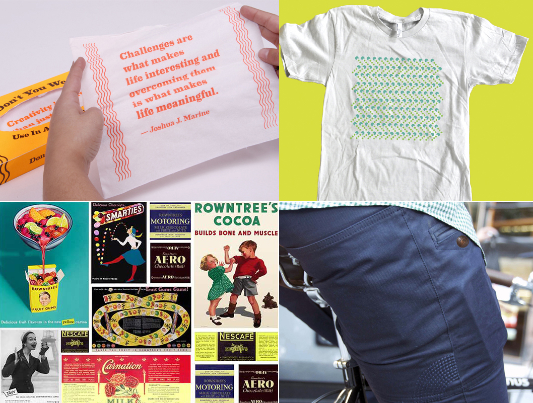
The limited-edition “Don’t You Weep! Tissues” by Hugo Santos feature inspirational wisdoms and quotations printed on them, so that the person in tears could cheer up by just looking at them. The boxes were designed in fluorescent orange, the color that channels energy and joy, for an extra portion of emotional support.
The “Living With:” T-shirt U.S. start-up visualizes mental disorders such as bipolar, depression, OCD and ADHD using simple dotted patterns. The arrangement of the repeating molecules, their shapes and colors symbolize the emotions of people suffering from these disorders. For people who experience the illnesses these tees can become ice breakers in an open conversation related to their mental state.
As to the physical “interventions” into the body of apparel, revolutionary cuts can not only make the person look stylish but also improve posture. The UpCouture tees feature elastic bands that encourage a person to maintain the upright position to feel comfortable. Jeanswear industry is already an explored territory, but one can try and discover new things in it as well. ABL Denim is creating jeans tailored to the needs of people with limited mobility—the cut, sewn-on elements, accessories are responding to the needs of wearers with special needs. Osloh jeans are designed specifically for cyclists—these denim pieces feature double and triple needle stitching, specific area panel reinforcement, antibacterial coating, and more. The two jeans projects successfully raised funds on Kickstarter ($16.5k of $15k required, and $70k of $30k respectively).
Nestlé has unveiled a reminiscence pack that is supposed to help elderly people with dementia bring back happy recollections. The vintage packaging can also be downloaded, printed on card or paper and cut out for the packs of excising products—the wrappers and labels fit the standard sizes of boxes and tins, so that visuals from the past could be “enhanced” with the much-loved confectionary tastes that are around for decades.
Graphic design eases social discomfort
Design also helps enjoy life pleasures in the situations where people usually feel restricted by the “proper social behavior” code.

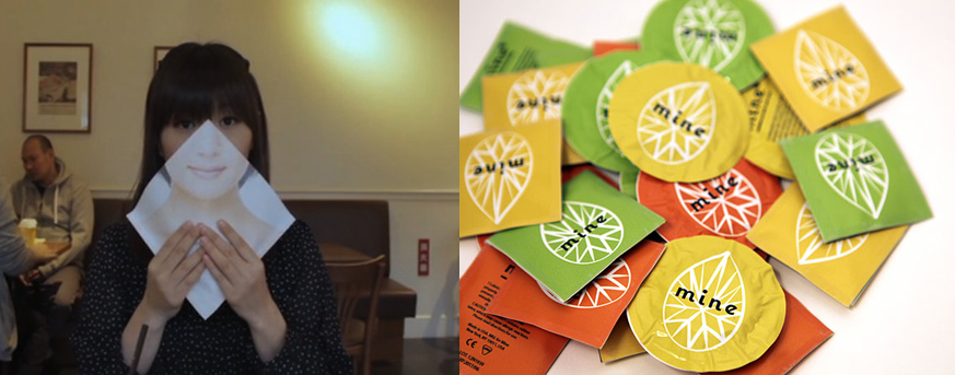
The Freshness Burger fast food chain in Japan approached the common rule that dictates female to have small mouths, “Ochobo,” with special wrappers that allowed women fully enjoy the restaurant’s biggest burger in public. The solution was simple—the burgers went along with so-called liberation wrappers that doubled as a face mask and covered a lady’s face when she was eating the huge burger. Instead of the wide mouth of the women, other customers could see a picture of a girl smiling politely.
Giving condoms and personal hygiene products a sweet, non-sexy look is another attempt to alleviate the social tension. This strategy was adopted by the Kotex brand that added a vibrant, pulsating splash of color to the packaging for tampons and pads. The latest examples of this trend are the Mine condoms and tampons delivered in gender-neutral packaging similar to candy or herbal tea wrapping. The ladylike packaging makes it more comfortable for women to shop the condoms in brick-and-mortar venues, carry them in the lady bags and store the products at home.
Adding features, rethinking the shape
Sometimes, minor tweaks to the shape and contents can significantly improve an item’s “health-related” image.

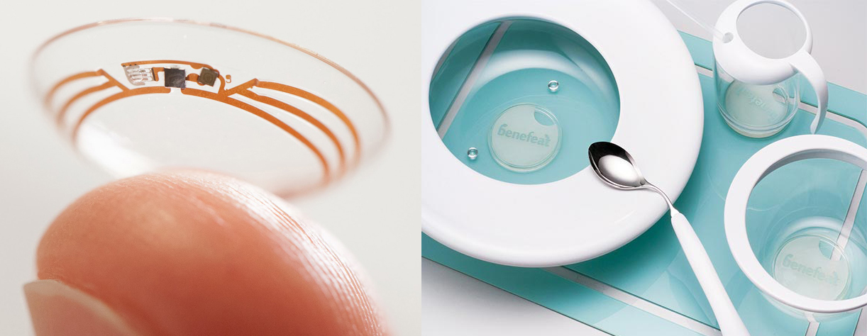
For instance, Google is now developing a contact lens for diabetics that will feature an embedded chip, able to measure the sugar level in blood. The miniaturized electronics chip will be integrated into a lens that will be visually similar to a regular one.
Two of the 2013 Red Dot design award winners have modified regular everyday items—dinnerware and buttons—to make it easier for elderly and disabled people to use them. Easy Buttons have a concave shape, are thinner, slightly angled upward at one side and thicker at the other side so that it would be more comfortable for the elderly to button up. Benefeat is a collection of five dining items tailored to the needs of those with cerebral palsy—the anti-spillage and non-slip tableware pieces have the shape and curves that fit the motor functions of people with such health disorders.
While sensor-based tech are now dominating the industry of smart FMCG, traditional design still plays an important role in helping a product obtain a new socially or therapeutically meaningful attribute. The number of variations within the design area is limitless for any product, no matter how mature and refined it might seem.
About the Author

Anna Rudenko is News Editor and Features Writer at Popsop, where she covers philanthropy, future technology and the environmental pulse of the globe. She is an art films aficionado, crafter, avid vegetarian, and sustainability enthusiast who does her best to bring positive change into the world around.