Last week saw the launch of the new corporate identity for the two global brands—The Hershey Company and Volvo Cars. They both have unveiled new logos and already received some ambiguous feedback from the fellow design community online.
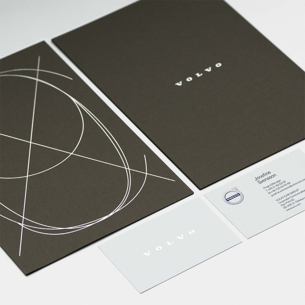
Volvo and their design partner Stockholm Design Labs have slightly flattened and simplified the «iron» logo mark, syncing its launch with the new model XC90 promotion. As the agency’s press release states, the updated logo conveys the brand’s vision of becoming «the world’s most progressive and desirable premium car brand.» Critics say the change is so minimal that it is questionable whether it was needed at all.
![]()
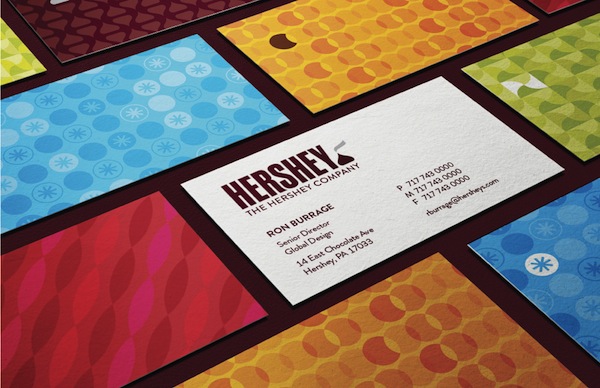
The chocolate making U.S. company Hershey has received much more negative response from bloggers and journalists, mainly due to the new interpretation of the Hershey Kiss icon. Designed in-house by the Hershey team together with Ohio-based agency goDutch, the new flat logo was set to «represent the company’s evolution from a predominantly US chocolate maker, to a global confectionary company». The new logo has been supported by the new custom typeface by New York-based Alexander Design Associates and marketing collateral materials.
![]()