Family (and friends) has rebranded Warburton’s snack range with an aim to shake up the category with both healthy and fun credentials combined.
Walkers, Britain’s biggest crisps brand, outsold Warburton’s, for the first time last year—a watershed moment for British grocery. Proof then, that in tough times, people love little food treats, small indulgences to brighten some of the dullness that bogoffs or private label supermarket ranges manifest.
So it made perfect sense for Warburtons to reimagine snacking—to use their unique expertise in baking to create a simply baked pitta chip, seasoned with natural flavours to compete with this hugely successful plethora of crisps, extruded potato starch and corn snacks.
They’d had a go or two before at getting the proposition right, but focused too much on kiddy fun, then retrenched and made the offer to generic, effectively back to a product extension of their breads.

Pic. Warburton’s chips previous packaging
Despite great product credentials, the ‘brand’ was struggling to engage and a crucial ‘make or break’ business decision was required. As a result we were commissioned by Warburton’s Category Director Martin Garlick to completely rethink the brand strategy, develop a new look, with whatever necessary research that it required. We were selected on our strength of experience in branding the snacking sector, having helped Walkers build their brand whilst directors at Landor Associates some years back; especially the success of Sensations.
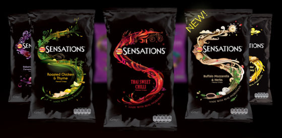
Pic. Walker’s Sensations
The key challenge was to take Warburton’s, essentially an everyday bread and morning goods brand and extend into a credible evening snacking, which is primarily about fun, flavour and essentially, escapism.
Multiple brand propositions and naming options were put together and presented to UK 20-40 year old UK women in a series of groups, looking primarily and what would get them to trial a bread based snack. Consumers must never drive your brand direction, but their interests and motivations must—we always design for real people and for commercial success. We have a mantra that says; “make brands that people love to love”.
The resulting new brand positioning revolves around the idea of a ‘Happy Adventure’—bringing to together the product’s global flavor influences and the opportunity for consumers to ‘escape’ once in a while. The strategy will help drive not only packaging, but also brand communications and promotions we anticipate.


Pic. Warburton’s crisps new packaging
Naming is such a tricky thing these days, with very little left in the world available to ‘own’, but we think in ‘Escapes’ we have found something that has a real chance of getting consumers to take some notice on shelf.
The graphic design element aims to create a flavor journey that travels across various continents, with collaged illustrations created by children’s book designer Andrew Griffin and food photographer Howard Shooter. Early indications suggest the new look and feel is delighting consumers, especially existing users—Facebook is such a useful litmus test of feelings towards a packaging and identity move.
Most importantly it’s a fun and playful solution, properly tapping into the semiotics associated with the category—giving aisle browsers what they expect but with a fresh twist; what we’d describe as the shopper trial golden balance.
The new look goes on sale from this week in multiples across the UK.
About the Author

Derek is an experienced Creative leader, having worked for the last 24 years at brand communication agencies such as Siegel+Gale, Saatchi & Saatchi Design and Landor Associates, where he became board creative director. He has worked extensively with major brand owners such as PepsiCo, P&G, Coors and Reckitt Benkiser.
In 2009 Derek Johnston co-founded Family (and friends) with his partner Alex Durbridge. It’s a very different take on the traditional agency model.