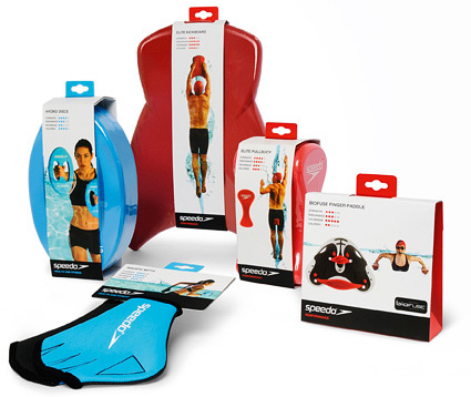
Stocks Taylor Benson has redesigned the graphic and structural packaging for the global relaunch of the Speedo Training Aids 2011 collection.
Stocks Taylor Benson was briefed to redesign the packaging graphics and structure, where clear segmentation, instant understanding of product usage and obvious fitness benefits would be key to maximising sales potential in both new and mature markets.

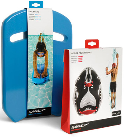
The range has been clearly segmented into ‘performance’ and ‘health and fitness’ categories to differentiate between serious swimmers and health and fitness enthusiasts. The categories are clearly identifiable by the use of colour: red for performance and blue for health and fitness.
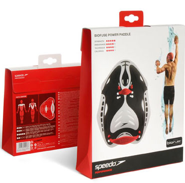
The packaging sees the introduction of the Speedo Data Centre, an easy-to-understand guide to the functional and fitness benefits for each product. Consumers can now easily identify the products that will help them achieve their own specific goals in the pool, whether that’s improved swim technique, rehabilitation or toning up for holidays.
The new designs also feature lifestyle photography and a flexible graphic water device. Contrasted against a white background, the photography gives the range a unique look and ownable graphic identity, with the product prominently featured for clear and immediate communication of its usage for consumers. Typography and copy are clean and simple, minimising language translation for this global range.
The card pack constructions are designed to reduce the amount of raw material and gluing. For larger products, a new banding system was created, allowing the products to be seen and physically touched. Euro hooks are used to strengthen and secure the structure.
Speedo will also be supporting the range relaunch with in-store point of sales material. The redesigned packaging for the range will be available online and in stores including Speedo’s own retail outlets, Decathlon and John Lewis this week.

