In March 2008 London-based creative consultancy LFH developed the new package design for Grant’s whiskey.
Brief
Grant’s had become unfocused, was unclear what it stood for other than its triangularity and lacked a credible, relevant and motivating proposition and personality. The brief to LFH was to restore pride and confidence to the brand and to build on its rich heritage whilst retaining and enhancing authenticity and quality cues.
Response
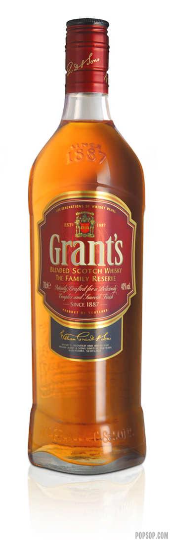
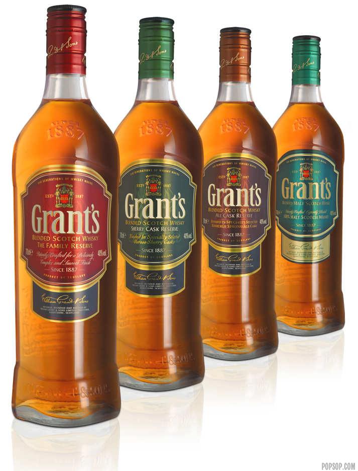
The change to a rich burgundy as the key brand colour is significant. It is rooted in the past whilst being bold, fresh and new; it is differentiating and ownable and creates real shelf stand-out. Crucially it celebrates the quality of Grant’s establishing a real link to the richness and warmth of the whisky. The second key development is in the bottle shape. The new design builds on the iconic triangular shape and highlights the brand’s authenticity and quality.
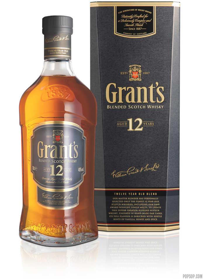
The more rounded profile suggests refinement and nobility. The plinth adds authority and strength. The taller profile and raised shoulders suggest pride and confidence. The new design has been taken across the range to establish a family feel for the first time with the decanter style 12 Year Old delivering further uniqueness and premium cues.
Testimonials
“The new-look Grant’s range now feels proud and confident – as it should. The new design manages to respect the heritage of the brand yet embrace the new; most importantly our pack now better projects the superb quality of the Grant’s Whisky inside.” – Grant’s Global Brand Director.