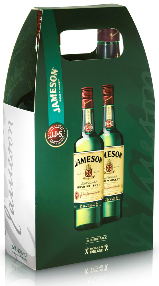
Jameson in conjunction with Coley Porter Bell has developed a new creative strategy for Jameson Irish Whiskey to reinforce its premium credentials and give it a more distinctive and ownable look.
The device which will appear on all outer packaging is based on the signature of brand founder John Jameson which appears on the bottle label. It consists of a triptych of three signatures layered in differing shades of green.
The identity echoes the key physical and emotional attributes of the brand—that it is triple distilled, resulting in a smooth taste and relaxed lyrical Irish character.
“We’ve taken a very traditional element and treated it in an engaging and contemporary way that adds value to the brand and provides a broader platform for promotion, “said Stephen Bell, creative director of Coley Porter Bell.
Commenting on the new visual ID, Nick Blacknell, Jameson Global Brand Director said, “In order to build an iconic global brand we needed to convey a consistent and distinctive visual ID. To do this we leveraged existing strong visual equities such as the colour green and the John Jameson signature which resulted in a refreshed new look and feel for the brand.”
The device will be rolled out to all Jameson’s markets.
