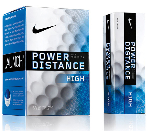
Nike has unveiled new packaging for its Golf ball category. The aim was to help distinguish it from competitors and brought more consistency to brand placement. Before the changes, the packaging was fragmented and so the message was rather confusing. Now the packs have more consolidated and refined look at retail.
The challenge was to consolidate sub-brands by moving the entire product line into the cube shape – a signature form for Nike Golf. The designer group headed by creative director Satoru Igarashi was to create a consistent placement between the global mark and sub-brands while retaining the personality of each product and establish a strong information architecture that can be shared across all brands.
This result has enabled Nike Golf to capture premier end-cap space in retail venues. In addition, the cube shaped structure, consisting of up to 70% recycled fiber content, reduced paperboard consumption by more than 30%.
Source www.rebrand.com


