Pearlfisher again has redesigned the packaging graphics and embossed pattern on bottles of the ‘feminine’ beer brand Redd’s, since March 2012 owned by Efes, who bought the business in Russia from Sabmiller.
Along with the redesign of the packaging, the company introduces a new green apple-flavoured variant Redd’s Dry.
As the client’s press release says, a new design «looks more appealing and elegant».
The relaunch of the new look as well as introduction of the new variant will be widely supported by marketing campaign in Russia.


Photo: new package design of Redd’s, designed in 2012
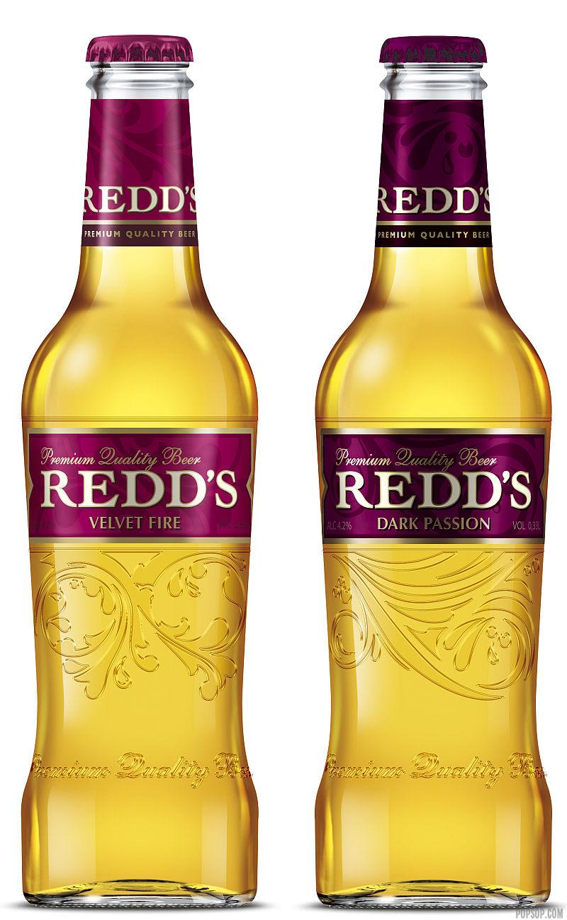
Photo: old package design of Redd’s, designed in 2009
Commenting on the new design, Sarah Butler, Deputy Creative Director at Pearlfisher says: «We have refined the design, reigniting the passion and desire for Redd’s through a sophisticated and sensual aesthetic. The new design emphasises Redd’s powerful and sophisticated femininity through iconic elegance. The label shape accentuates the feminine design cues and the embossing on the bottle works organically with the label design, flowing to create a natural curve. The colour palette maintains the light and dark tones of red that gives the design its depth and richness.
The refined design communicates a more obviously feminine aesthetic, which reflects the changing values of the female Russian consumer, moving from an overtly powerful aesthetic to a more sophisticated one.
The design reinforces Redd’s confidence and dynamism creating a new, contemporary, seductive and authentic expression».