Pearlfisher has devised and developed a strategy, name, tone of voice and iconic brand identity for Jamie Oliver’s Better Food Foundation, an initiative created for helping spread healthy eating habits across the globe. Today, a range of deceases originate from bad diets, and the Better Food Foundation is committed to contribute to establishing a world were high-quality food matters and people consume more healthy products to lead more productive and happy lives.
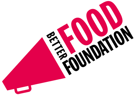
Photo: The brand identity for Jamie Oliver’s Better Food Foundation
To celebrate the mission of the initiative, which is all about raising awareness of healthy eating habits and encouraging people to reconnect with real food, Pearfisher made a megaphone the key feature of the visual identity. The clean and vibrant visual elements call to action, inspiring people to switch to healthy foods and take individual responsibility for their own wellbeing.
“We created an identity that could champion this important global fight. The megaphone icon is a universal call to action explicitly asking people to pay attention and be part of it. The use of strong, vibrant colours conveys the energy and passion of the people involved and reflects Jamie Oliver’s own relentless commitment and focus on the cause. This is an identity that needs to be acknowledged at both a grassroots and corporate level. Therefore the identity is both serious and accessible, bold, celebratory, confident and inclusive,” commented Pearlfisher Creative Director, Natalie Chung.
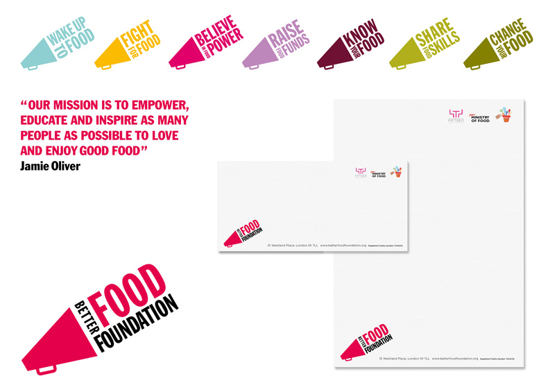
Photo: The brand identity for Jamie Oliver’s Better Food Foundation (click to enlarge)