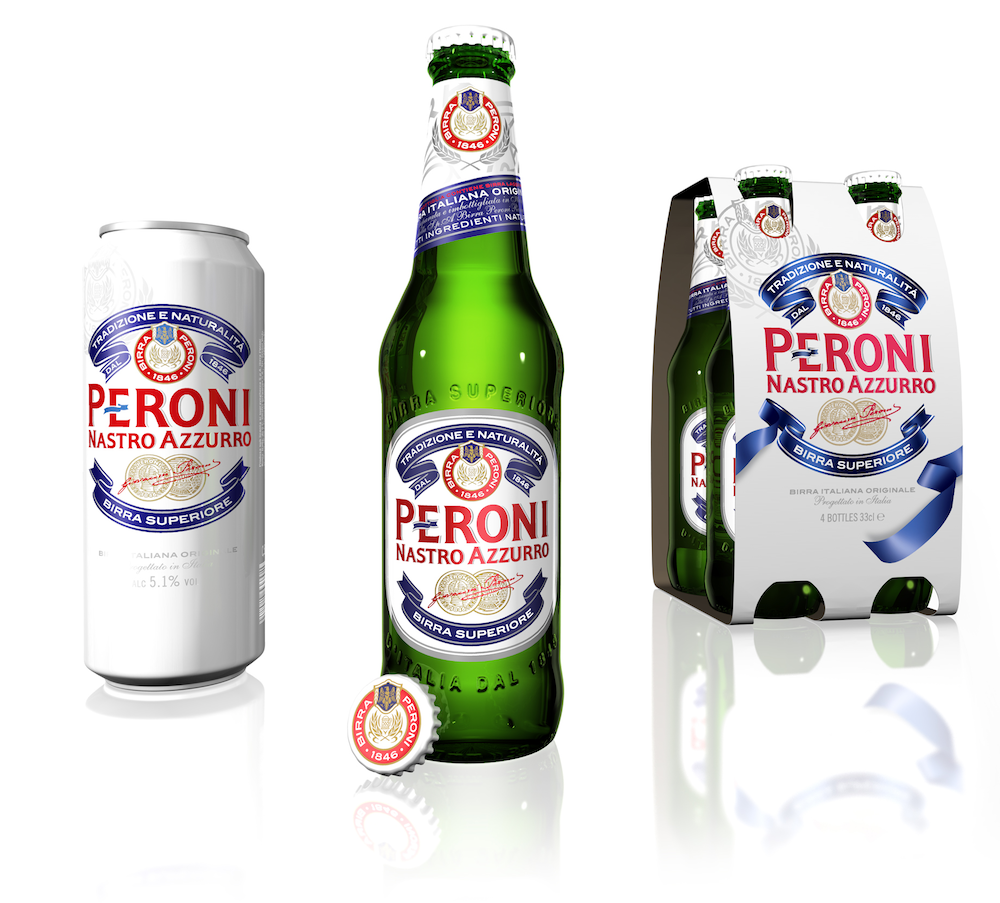
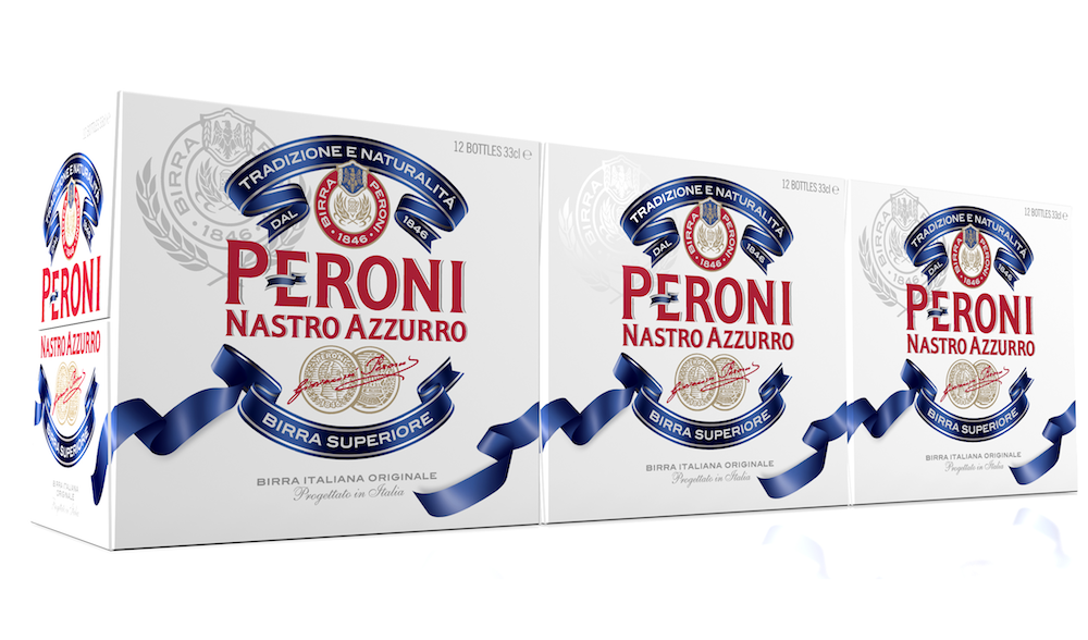
Peroni Nastro Azzurro’s new timeless design continues to embody effortless Italian style and keeps the brand relevant to its target audience. The new look designed by JDO will be launched in early May and rolled out globally.
JDO were briefed to preserve the recognizable Peroni Nastro Azzurro iconography whilst evolving the design and adding new premium elements. Peroni Nastro Azzurro’s Italian craftsmanship and authenticity are still at the core.
The result is a cleaner design with fewer embellishments. The typography is simplified with less pronounced seraphs and a silver drop shadow below the Peroni Nastro Azzurro branding.
“The new presentation builds on Peroni Nastro Azzurro’s unique equities with greater clarity and a fresher feel. The difference shouldn’t be so much noticed, as felt,” says Paul Drake, JDO’s Creative Director. “Peroni Nastro Azzurro doesn’t play by the typical beer rules, it plays by style rules and that’s a unique and inspirational positioning to leverage.”
Photo: new look of Peroni Nastro Azzurro global packaging

