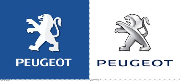
New times come, new logos come with them. The global companies prefer not to change their identity completely and undergo slight rebranding. The French auto company Peugeot is one of those who introduces their new look without global reconstruction. The rebrand is dedicated to the 150-th anniversary of the brand’s iconic lion in the logo. Last week the Peugeot introduced a line of new concept cars as well as a new look of its feline emblem along with a new tagline: “Motion & Emotion”.

The lion, which has been the logo of the Peugeot company, was the coat of arms of Franche-Comté, the birthplace of the brand’s founders, and was first used on the saw blades it produced to represent “the toughness of the teeth, the flexibility of the blade, and the speed of the cut.” Over the long period of its existence, the emblem has been changed for many times, but it still preserved its exquisite nature and a high degree of recognition.
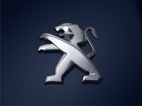
The new image definitely fails to keep the tradition accurately. The front legs of the old lion were stronger, while the new one’s paws are more like to belong to a bear. The snake tongue of the previous lion has gone, too. The new version of the emblem is mainly sleek and shining, but some parts of the creature’s body are performed with a dull luster, making the emblem look rather simple. The creators decided to play with depth and shine, but obviously lost the game — the result looks rather weak, comparing with the previous image.
The presented typography looks like the one of Citroën, which is owned same parent company, PSA Peugeot Citroën.
The Peugeot RCZ sports auto was selected to be a pioneer in carrying the new branding. Still, the logo seems to be in line for many years, so we are either to get used to it or forget.
The launch of cars with the new emblem is set for May.

