Package design expert P&W has re-designed visual identity, packaging, prints and POS materials for its long-standing client, Tesco’s US-based retailer Fresh & Easy Neighborhood Market. Two subbrands — the Organic and Kitchen TO GO — have seen a complete revamp.
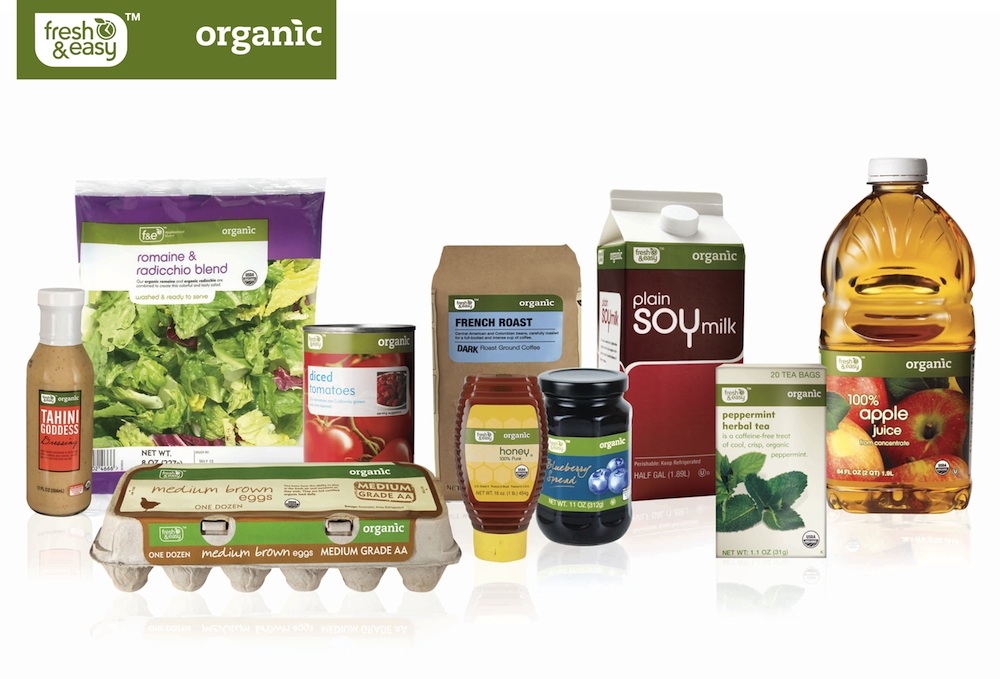
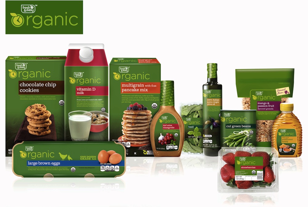
The agency spokesperson comments on the work for the Organic range: «We wanted to create an ownable solution so incorporating part of the F&E logo into the organic branding was our solution. F&E Organic logo became the main focus on pack, instead of just an endorsement or sign off. We hope the range comes across with a modern contemporary look with all the premium cues that Organic products deserve.»
Photo: new package design for Fresh&Easy Organic

Photo: old package design for Fresh&Easy Organic
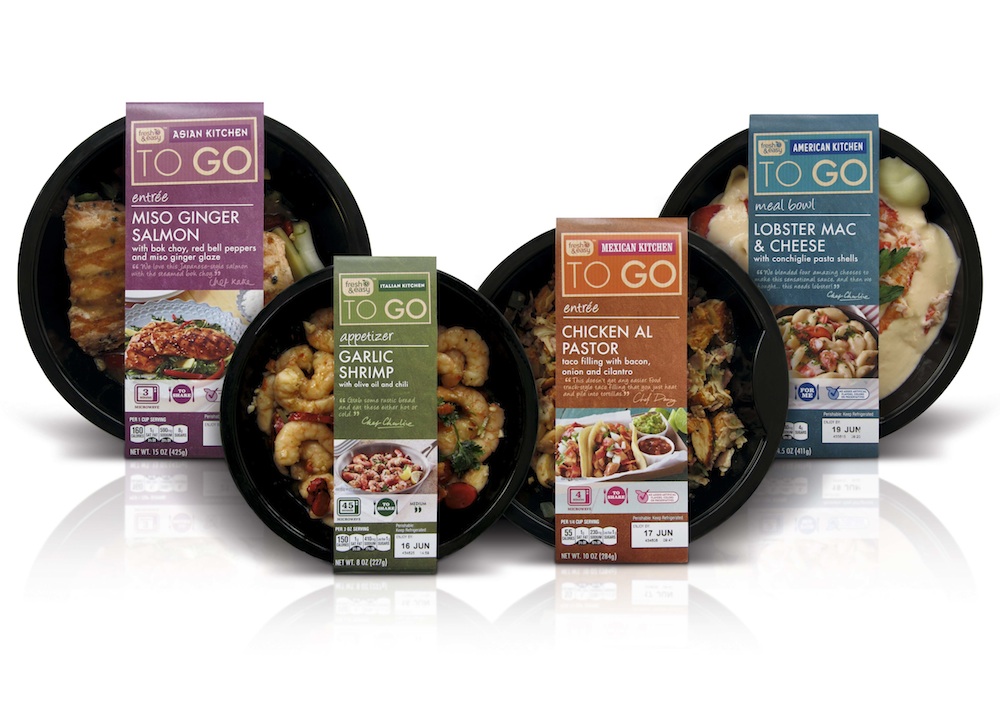
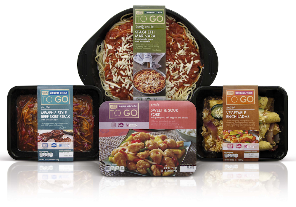
On the project for the «KITCHEN TO GO» range the task was to encompass 150+ fully prepared and ready-to-heat products under one single subbrand. To mimic a restaurant experience the range is split into eating occasions — meal bowls, appetizers, sides, entrees and family entrees are called out on the front of each pack.

Photo: Fresh & Easy KITCHEN TO GO range redesigned
Here are some other package design works for Fresh & Easy by P&W.

