The Brand Union has created global branding guidelines for female hair removal brand Veet as part of its campaign to shift perceptions of hair removal from necessary chore to sensual ritual.
Veet appointed The Brand Union, following a pitch, to implement branding guidelines on packaging to position the brand as «smooth, confident and playful».
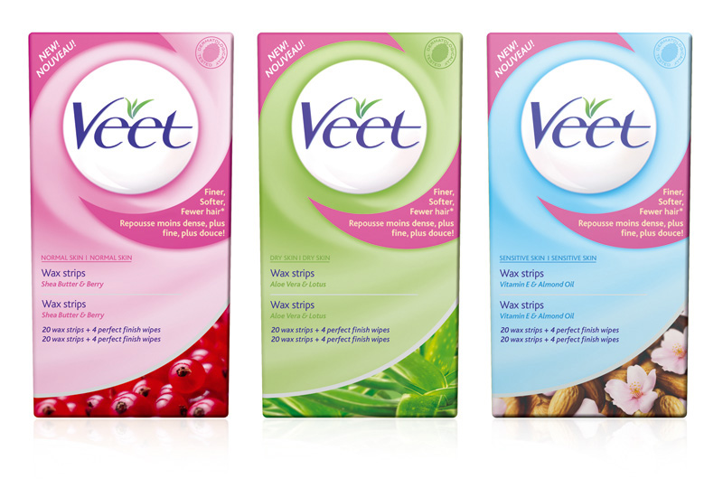
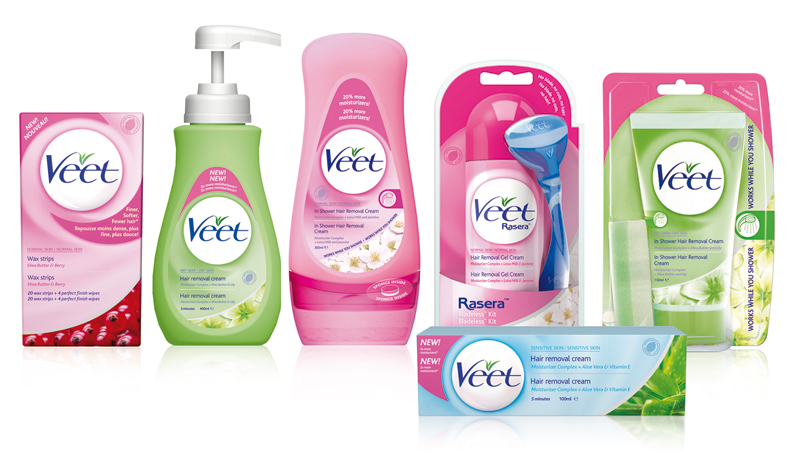
The guidelines will cover Veet’s portfolio of hair products comprising a total of 57 formats covering both creams and waxes, which are segmented into body parts and skin types.
Veet will now be unified across all formats, with clear colour-coded navigation between products.
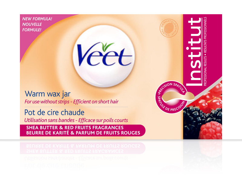
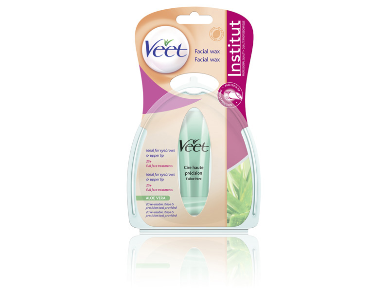
The Veet «pearl» logo is a key feature of the improved design and the packaging will be colour-coded in natural pink, green and blue to denote skin type. Iconography will guide customers on parts of the body products are intended for.
Imagery of ingredients such as aloe vera, bee wax and almond oils sit in a device that also holds product content information.
The Brand Union has also devised a system to carry promotional information on packs to ensure that they work with the new look and feel of the design.
Dave Brown, UK chairman of The Brand Union, said: «The challenge here was to increase the emotional appeal of the brand. We knew that the target market of women in their twenties saw hair removal as a functional chore, and we’ve tried to make it a sensual ritual through appealing feminine, sophisticated packaging, a refreshed link to glamour and beauty and a unified product range that is easy to navigate.»
A spokesperson for Reckitt Benckiser, which owns Veet, said: «This is the most comprehensive marketing push we’ve ever launched for Veet. The Brand Union was initially tasked to address the brand’s colour palette, unify packaging across the brand and create a consistent system for promotions — and the new brand guidelines achieve all those objectives.»