The article is written by Darren Foley, Managing Director at Pearlfisher, London
We often talk about great brands as icons. Well-respected and loved, they enter into our culture and consciousness to form reference points that shape our existence. Over time, brands with a specific provenance can become national treasures, symbols that represent our world.
Heritage, legacy and national identity form the backbone of many of our favourite brands: Burberry, Liberty, and Cadbury have become cherished and emulated icons that are rooted in a clear British character. Similarly, American heritage and identity is evoked through the equities of brands like Nike, Jack Daniels and Harley Davidson. Hermes and Chanel evoke a chic Parisian style, and Armani and Ferrari capture to the passion and flare of Italy. Whether they choose to share their legacy through storytelling, language or traditional iconography, these brands position themselves with core statements and authentic truths. Being synonymous with your provenance can be a very valuable attribute – especially at the right time in history when National events are global news.
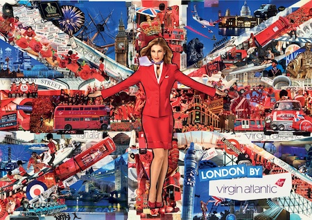
Photo: Virgin Atlantic’s «London» global campaign
This month, as we gear up to the 2012 Olympics in the UK, Virgin Atlantic launched their global campaign; simply entitled ‘London’, it recreates the instantly recognisable Union Jack and reinterprets it with bright images of the city, a sense of cheekiness and a distinct Virgin style. The result is fresh, striking and, as Breda Bubear (Head of Global Advertising and Communications at Virgin Atlantic) comments, puts an emphasis on “the ‘Britishness’ that our nation is famous for”.
From a design perspective, it may seem simple to try to construct or bolster a sense of provenance, particularly when it comes to nationality: We see many brands jumping on the National bandwagon in the run up to big events. A Union Jack in the run-up to last year’s Royal Wedding and this years Diamond Jubilee or Stars and Stripes, red or blue in the run up to the American presidential elections. But gratuitously exploiting these emblems or simply adding them on can often appear lazy, lacking depth and meaning. The reason Virgin’s ‘London’ works so well is because it retains Virgin’s core equities and emphasises them. The Virgin stewardess, dressed in red, which the brand is synonymous for, remains central to the ‘London’ design. For brands to play on National heritage, they need to do it in a way that draws on and becomes part of their existing brand truth and visual equities.
There are brands who, despite having strong histories and loyal followers, could be using design more effectively to reinforce their status as National treasures. Marks & Spencer and British Airways are well-trusted British brands but can feel tired next to their peers who have managed to combine their heritage with new, dynamic expressions of the future. Does our love for them come from comfort rather than covetousness? There is a real opportunity for brands with a great National heritage and provenance to celebrate this in a modern way through design, looking forward as well as celebrating where they have come from.
About the Author
Darren Foley, Managing Director at Pearlfisher, London, joined the company in 2002 as Realisation Director, inventing the concept of realisation and advocating a design process in which our technical and creative teams work in harmony from the beginning. He has worked in the design industry for close to 25 years, starting out as a junior production artist, and amassing an unparalleled depth of knowledge for the discipline.

