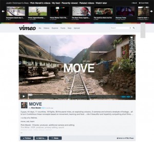
Video sharing platform Vimeo is undergoing a major redesign of its website. This is the first big Vimeo design change in more than five years. The new design gives the platform a cleaner look and aims to underline Vimeo’s focus, video.
Photo: A sneak peek on the new Vimeo design, from vimeo.com/new, clickable
First, Vimeo is launching to a wide private group before rolling out to the general public. A sneak peek shows that Vimeo’s video page is more cinematic now, with a larger, full-width video player and fewer distraction, which is good for eyes. It also features better browsing and a new feature called ‘following’. It means that users can follow other people, as well as tags and channels.
Vimeo’s old design remained unchanged since 2007, which proves it was strong enough to endure time and look modern. But the platform has become larger and added more features, so the code base needed to be refactored. Every page on the site was rewritten to become more scalable and efficient. The new design allows Vimeo adding new features more quickly.
Vimeo’s competitor YouTube changed its design in December 2011 and now looks more Google-like.
The new design will roll out within a couple of weeks, according to Vimeo.
