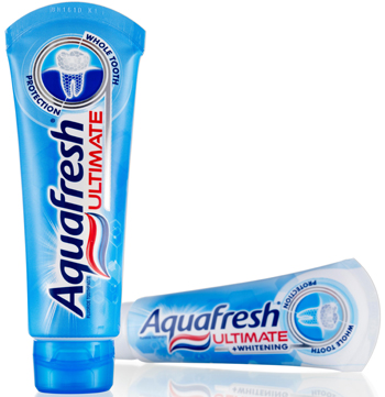
Aquafresh® ‘Ultimate’, the new ‘Whole Tooth Protection’ flagship brand for GlaxoSmithKline (GSK), is the result of a close collaboration between GSK in-house PacXperience & Consumer Healthcare Futures and strategic brand innovation & design consultancy Webb deVlam. It has been just launched in the UK following recent successes in France, The Netherlands, Italy and Germany (the first territories in an international roll-out schedule that commenced in March).New Aquafresh Ultimate toothpaste works to deliver whole tooth protection. The new platform builds on the reputation of Aquafresh as a family oralcare brand and marries it with the scientific expertise of GSK R&D to create the new proposition. Aimed at the primary consumer—the caring, nurturing mother who purchases on behalf of the health of her family—Aquafresh Ultimate appears in an innovative packaging format with strong graphics that employ semiotic codes to communicate its efficacy and premium positioning. The objective was to drive the scientific credentials of the Aquafresh brand by launching a paste that competes in the premium segment of the category.
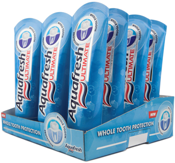
It is the first brand in the UK toothpaste category where the primary packaging—the tube, is the hero at the point of purchase. The category convention of the tubes being horizontally merchandised within a secondary carton has been challenged by Aquafresh Ultimate dispensing with the need for the carton and the distinctive tubes being displayed vertically in a shelf-ready tray. The effect is to create visual disruption and standout from the wall of competitor cartons. The presentation promotes the brand with the ‘halo’ icon at the top of the pack with the curved end seal profile facing the consumer. The SRP features a 3-dimensional fresnel lens to highlight the benefits, this is another first in the category and draws upon Webb deVlam’s experience of using this cutting edge technology for Bombay Sapphire packaging.
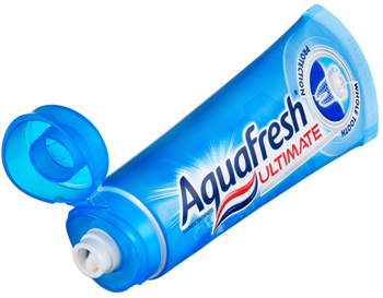
Aquafresh Ultimate is packaged in a self standing tube for which Webb deValm supported the concept development phase of the ‘stay clean’ flip top cap. The cap features a distinctive white nozzle indicating a healthy tooth surrounded by an Aquafresh wave shaped translucent hinged cap to represent a healthy gum and “whole tooth protection” above and below the gum line.
Aquafresh Ultimate uses graphic cues to communicate and educate. Webb deVlam has drawn focus to the Aquafresh Ultimate logotype executed in a specially designed scientific typeface and the technical, yet friendly, depiction of a healthy tooth and gum line to communicate the benefit. Semiotic codes are used in the form of a circular frame to communicate whole tooth protection, safety and security for the family. Meanwhile the depiction of a healthy tooth magnified in a silver foil-blocked ‘dentist’s mirror’ suggests professional quality. There are also subtle allusions to scientific hexagonal symbols to indicate Aquafresh Ultimate’s scientific credentials.
The elimination of the carton has already produced some remarkable results in environmental benefits. GSK estimate the elimination of this secondary packaging will save 2240 trees and avoided using 320 tons of paper.

