As censorship of tobacco branding becomes increasingly strict, it raises the question whether alcohol is next on the hit list? Many emerging markets are already restricted in the way they advertise alcohol, and this looks set to continue. Establishing a visual icon now could better equip brands for a heavily regulated future, as tobacco brand Malboro has with its recognisable gold/red and white triangles.
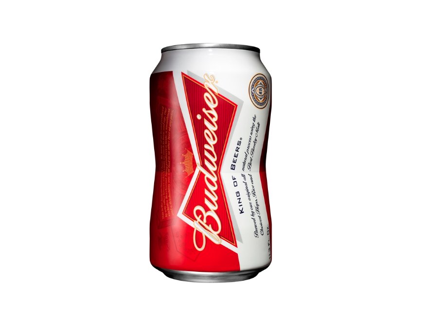
Some brands are already ahead of the curve. Realising the need to adapt to new legislation, Budweiser, the self-proclaimed ‘King of Beers’, has unveiled the fruits of two years’ labour with new structural packaging innovation, that they hope will help to resist the potentially terminal trend. The brand has also seen a worryingly consistent decline in sales over a period of more than two decades, so it’s no doubt that with this in mind as well, the brand was intent on making a change.

It could be a shrewd move. We often see in our research with consumers how pack structure can disrupt a category, capturing consumer imagination in a way that graphic redesigns simply can’t match. But it can also be a risky business, since new structures mean new production lines—with all the vast capital expenditure involved. So when a brand makes the leap, it’s a big, brave gamble.
So has it paid off?
Well, the new can is certainly striking. The ‘pinched’ look, made possible by advancements in manufacturing processes, will drive a strong level of shelf stand out. It’s even ‘on trend’, fitting neatly into the ‘Broken Structure’ design trend, which we identified in our Emerging Trends 2013/14 report — quite a feat given the lead-time from conception to market. And while detractors will no doubt joke that it looks like the can that’s fallen off a lorry, it’s certainly engaging—which can’t be said for standard cans.
But the strategy behind this new can goes beyond driving engagement. The innovation marks another step in Budweiser’s continued elevation of the ‘bowtie’ device to a key piece of brand iconography.
This ‘heroising’ of visual icons like the bowtie is happening across FMCG categories. In a quest to make themselves more distinctive and instantly memorable, brands are distilling their visual equities down into a single icon that stands for the brand. For example, Häagen-Dazs recently deployed their ‘cartouche’ without brand name in a recent teaser for their ‘House of Häagen-Dazs‘ campaign; similarly we worked in partnership with Chivas Regal to establish their new brandmark, the Luckenbooth.
So the bowtie can seems a smart move by Budweiser. But of course, there are risks: consumers get less beer for their buck, manufacturing costs are greater, and twice as much aluminium is used. Nonetheless, Budweiser will be hoping the strategic benefits outweigh these drawbacks, as well as justifying the huge investment they’ve made. Failure would be costly, but success could help return the ‘King of Beers’ to its throne.
About the Author
Stuart Costley is Senior Vice President of the design research agency The Big Picture. One of Stuart’s key roles concerns operations, which he oversees to ensure the smooth running of the agency, and the upholding of best practice techniques and quality standards.
