It’s that time of year again when we get sucked into the festive frenzy and with it the ever more blatant marketing to children and the endless, endless advertising…But, whilst TV and the Internet may still be huge communication channels of choice for this audience, the fragmentation of communication in recent years means that the opportunity for design expression has exploded. And, we need to think about just how we are designing for children and stop doing them a disservice by dumbing down.
Obviously, we don’t want our kids to grow up too quickly. But many young people are no longer buying into blatant kiddie marketing tactics. They are making more considered and sophisticated brand choices and we need to start catering for this new design savvy, eco-conscious and charitable consumer. The very nature of the world today is bringing young people into more direct contact with packaging than probably ever before. And packaging can introduce them to greener and more sophisticated choices through interesting products and intelligent packaging that convey strong brand messaging in a different and balanced way – and which are still visually desirable.

Clementine Art produce a range of art and modelling materials. It is non-toxic, the packaging is 80% post-consumer recycled and the design is effortlessly charming in its simplicity. The Soy Crayon Rocks lunch bag structure and clementine motif recall a safe, healthy and happy childhood image and the predominantly pure white packaging immediately stands out in a predominantly artificially coloured environment.
But, it’s not just about the brand choices young people are making in terms of toys at Christmas but the brand choices they are making in everything from beauty to beverages…
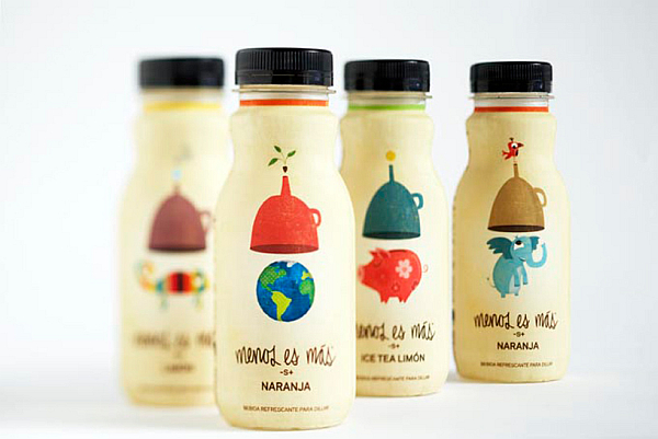
Juice drink Menos es Mas (‘less is more’) makes litres of refreshment with just a small drop of concentrate as referenced in a design that literally transforms ‘birds into elephants’. The brand prides itself on less space, less waste and bringing ‘optimism and joy’ into the everyday – clear, simple and heartfelt messages perfectly conveyed through delightfully different and beautifully stylised pictorial design – and winningly attractive to both children and adults alike.
Who knows, in just a few years we may see a new form of ‘pester power’ with kids influencing and educating their parents’ brand choices The ‘little big people’ are watching and awaiting your every move… Don’t disappoint them – give them smart and stylish design choices.