Interbrand NY has refreshed the visual identity for the telephone directory of businesses, Yellow Pages. The rebranding will help the international company, which has been delivering the references on paper for nearly 130 years and went online in 1996, to appeal to the younger audience.
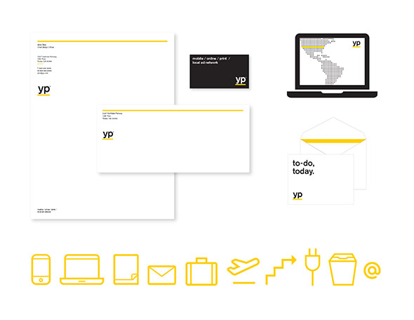
The rebranded logo transforms from the app-inspired jewel to a minimalistic YP letters underlined with a simple yellow bar. The focus is made on the clean, bold, typography within the corporate system. The headlines are now yet easier to read, and the yellow colour goes to a new level—from a mere signature shade to a «helping hand» that points the way to useful information or highlights a result. Interbrand explains that “the gestures of the doer inspired the design team: underlines, checkmarks, circles, and highlights—where the yellow line becomes a visual shorthand for efficiency and task completion.”
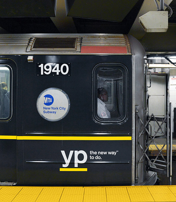
The refreshed Yellow Pages brand aims to appeal to people who are full of energy and passion to live their lives, not watch them passing. To support the launch of the rebranded identity, this week the company is also rolling out a campaign by BarrettSF that targets “doers,” task-orientated people who want a handy tool to accomplish their daily objectives. The new positioning is clearly communicated through a new crisp and clear video with a focus on the YP’s signature yellow (view the clip below).
“YP is here to help people get things done. Everything we do is designed to make doing easier. That goes for our brand identity too. How we act, how we look, how we speak. Every YP experience should be simple, clear and quick. This video is a short summary of the YP brand identity system,” says Interbrand.