The Dutch design consultancy VBAT designed the new packaging for the imported Amstel Premium Quality Lager.
The Amstel brand has a proud heritage, stretching back almost 140 years. The Heineken concern, owners of the brand, see Amstel as a brand that can open up new markets with new beer propositions.
In a number of emerging markets image is everything. In these markets Amstel is relatively unknown. Being unknown, its image can be moulded to reflect its desire to appear contemporary and at the same time being a pioneer in new product development.
Being imported automatically gives the brand credibility and status. Whatever new developments the Amstel brand chooses for these markets must be done without frustrate the brand image in its big mainstream markets.
Brief
The product developed to attract new beer drinkers taps into the international consumer trends towards a growing appreciation for more accessible beer tastes and an increased focus on health awareness and well-being.
New, Premium Quality Amstel Lager provides the same alcoholic ‘kick’ as a standard beer (4.7% ABV). It is easy to drink, not bitter and not heavy. As a bonus it contains fewer
calories and fewer carbohydrates.
Amstel wanted to create a pack that felt different to standard beers. Something contemporary. Something new. Nothing less than an icon.

Solution
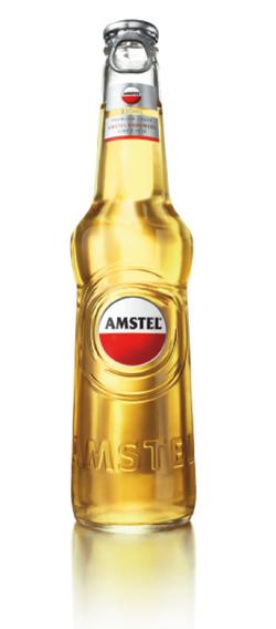
The result is the launch of the new Amstel Premium Quality Lager. The bottle profile developed is elegant, tall and transparent. Slim, light and yet still beer like. The bottle shape is spear shaped. Thrusting upwards.
The shoulder is pronounced and distinctive. The bottle ‘in hand’ is easy and light.
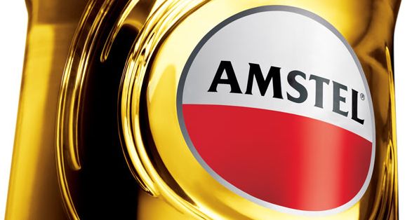
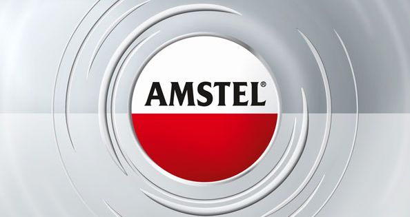
There is little graphic clutter on the bottle. The Amstel brand is simplified to its original circular device. A subtle 3D button effect modernises this iconic Amstel logo.
New Look
The relatively small size of the new logo makes the new bottle feel special. A ripple device surrounds the logo representing the brand character. Outgoing, self assured and magnetic. It is not composed of standard and traditional beer codes.
The ripple has been developed in a video and audio form. The addition of Amstel in a bold almost architectural letter type contrasts nicely with the refined logo size.
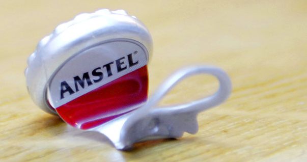
The neck label is clean. The silver background (signal colour of this Amstel product) together with red (Amstel’s colour in its main markets) project a fresh and modern character. Not baroque design, just simple and balanced. The pull top differentiates the pack from all the standard ‘crown top’ competition.
The secondary packaging is simple and contemporary, using the logo and the ripple lock up.
The product signal colour silver and the traditional Amstel red form the basis of all secondary packaging. Where necessary a product visual is added to create a refreshing presentation. To date the product has been successfully launched in Russia, Australia, New Zealand, Greece and Dubai.