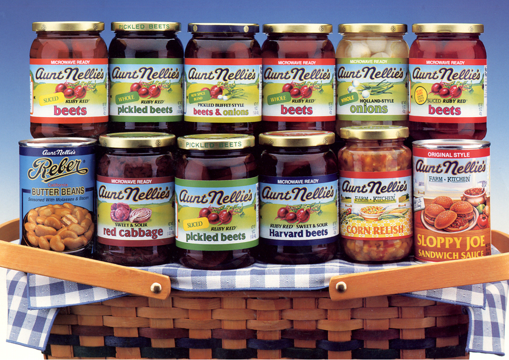
Seneca Food’s Aunt Nellie’s brand of pickled vegetables enjoys a large and loyal following of older consumers. With rising interest in the farm-fresh movement from a younger generation, Seneca was perfectly positioned to speak to a broader demographic. In order for the brand to remain relevant and differentiated at shelf and appeal to a larger consumer pool, Seneca turned to international brand and design consultancy, Dragon Rouge, to develop a contemporized packaging design to appeal to younger consumers.
before
The Dragon Rouge team infused modern design cues into the package without losing the full expression of the strong equity built around authentic farm-fresh production. “Our preliminary consumer research revealed that current users as well as younger prospective ones had a deep emotional connection to the key visual equity elements of the brand: the product name that indicates the persona of Aunt Nellie, the authentic farm background, and the freshness of the vegetables,” says Eric Zeitoun, president, Dragon Rouge. Together, they represent images of caring and health. All users and non-users gravitated towards the design solution that was able to strike the right balance between traditional equities and modern expression.
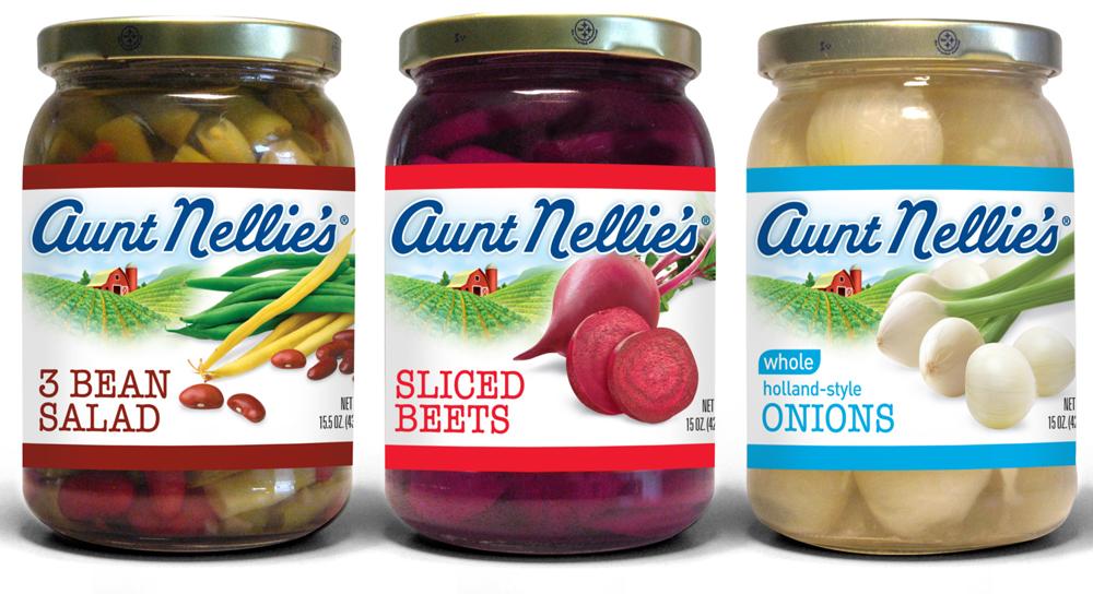
after
The winning design remains true to the farm-like heritage; using photography of ingredients to increase taste appeal; and assigning a new and powerful color-coded banding system to ease consumer navigation across the range and increase shelf impact.
The package design solution exemplifies how a mature American brand can be contemporized without alienating its loyal following or losing its strong equity.

