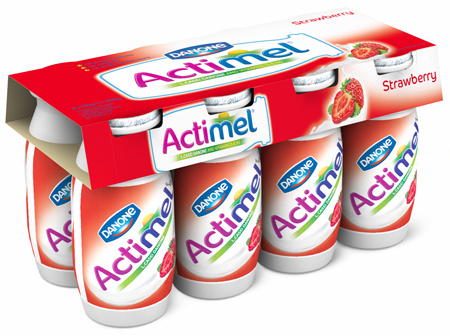
Actimel by Danone is the leading yogurt drink in the UK market and has created a successful presence on-shelf for over 10 years. However, its identity and packaging had hardly evolved in this time with only a few small changes to the logo, key messaging and icons.
Performance of the category in which Actimel sits has been challenging in recent years. In light of this, there was a pressing need, and opportunity, to reposition the brand (which started in January this year with the ‘Little bottle with a lot inside’ TV campaign) and therefore re-vamp the Actimel packaging to maximise consumer interest at point of purchase, attracting both lapsed and new consumers.
Dragon Rouge was assigned as the agency of choice in the UK to help the Actimel brand re-vamp its packaging. The aim was to simplify and modernise the packaging, whilst helping achieve impactful brand blocking and ease of navigation within the complicated fixture of yogurt based drinks through increased brand stand out and clearer flavour differentiation.
The agency incorporated the new, unified brand mark that heroes the iconic shape of the Actimel bottle. The outline of the bottle cradles key brand components, including the Danone corporate mark and the new warmer, more approachable Actimel logo. The new pack design is simple and modern, using a typographic style that communicates enjoyment and accomplishment and this is strengthened by the choice of vibrant colours used across all 13 variants in the range. The use of the sunrise iconography, positioned above the name, reflects morning and a time when most Actimel is consumed.
The new designs started appearing in-store from April 10, 2012.
Joel Kirstein, Assistant Brand Manager at Actimel said, “We’re confident the new Actimel packaging design achieves our aims. Testing of the new design showed promising results and we’re excited to see the end result hit the shelves this April.”
