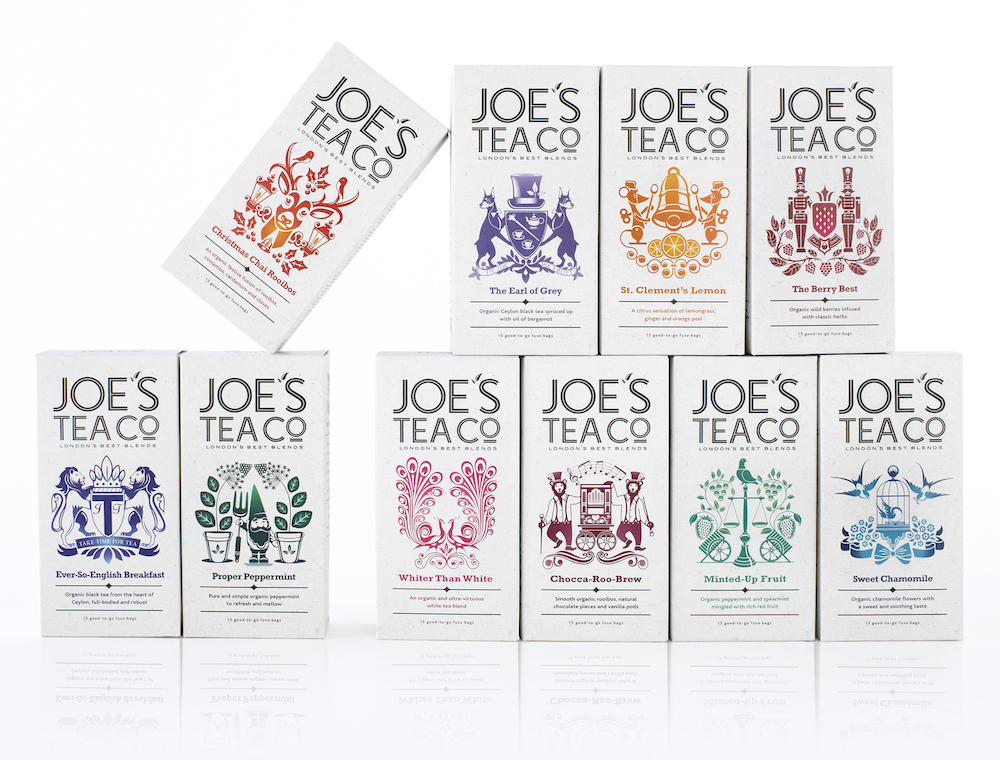
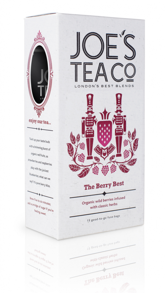
Design consultancy Echo has created positioning, brand identity, graphics and structural packaging, stationery and website look and feel for a new tea brand Joe’s Tea Company.
Founded by a former tea supply chain manager, Joe Kinch, the brand aims to appeal to the adventurous and younger tea drinkers as well as attract some new ones.
The design took its inspiration from traditional ‘City of London Liveries’ protecting the professionalism of key trades (e.g. the candlestick maker, butcher, baker) and added a contemporary twist. Led by Echo’s in-house designer and illustrator James Pearce, a range of ‘Joe’s crests’ were created to characterise individual flavours and enhance the expertise behind each blend.
A cut-out on the side of the packaging allows a glimpse of the whole leaves Joe uses to maximise flavour and creates a window into the heart of Joe’s Tea where the illustrations continue with a bespoke ‘Joe’s Map of London’.

Photos: Joe’s Tea Company’s logo, packaging and a special map, designed by Echo


