After releasing the shocking Nestle Kit Kit advert, Greenpeace UK is taking up arms against the new «Nature Polluter» — the energy giant British Petroleum. What do you think?
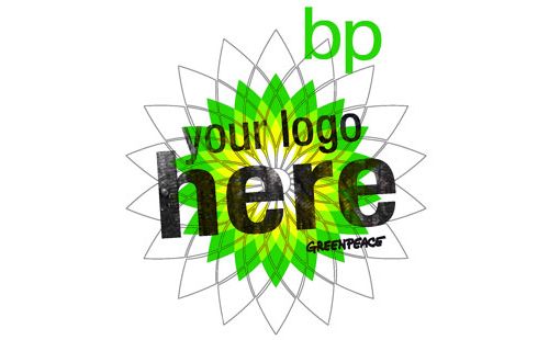
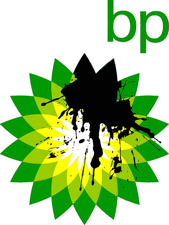
On May 20th Greenpece activists ‘rebranded’ BP’s logo, adding some drops of oil to the brand’s bright green «flourish» logo, thus, showing their sharp reaction on BP’s plan to invest in the the Canadian tar sands, which means the exploration of the dirtiest way of oil producing ever.
Current BP’s logo
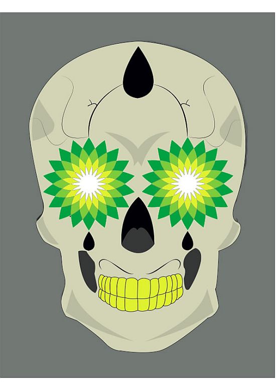
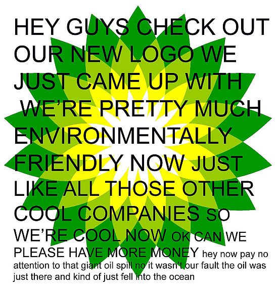
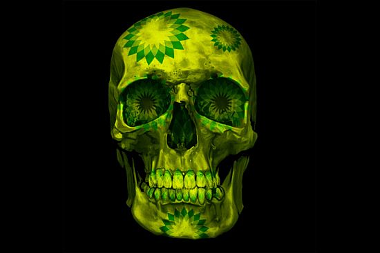
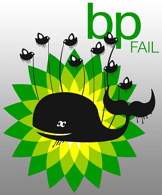
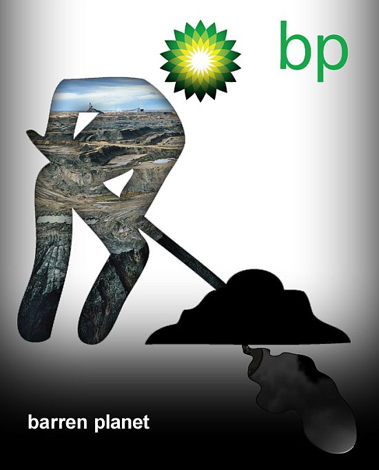
But that seems to be not enough for the British Greenpeace fellows, they have announced the new controversial logo contest, asking creative minds, who care about ecology and global environmental problems, to rebrand BP and redesign its current ‘innocent green’ logo.
Just a few years ago BP actually went through rebranding by positioning themselves as “Beyond Petrolium” company, which does not fit very well to their intention to do business in tar sands and deepwater drilling.
That’s why Greenpeace UK tasks caring activists — designers, artists etc — to create a new logo which really shows BP’s “predatoty nature”. The winning logo will be used in the new international campaign against the company.
Here are the things to help young (or not so young) creative fellows to express their vision on real BP’s face.
The entries are accepted until 5.30pm on the 28th June. They all will be displayed on Flickr, where you can already see some of the earliest submissions.
Learn the full competition rules here: http://www.greenpeace.org.uk/files/tarsands/rules.html.
Well, we think that this campaign might have a future. Most certainly, it will trigger a global trend of home-made logos rebranding, as well as slogans rewording for companies which fail to commit to them.
What do you think? Will this campaign yield some positive changes in BP action plan? Do you have some similar reveal-true-face campaigns in mind? How will this influence BP brand in general, do you think?
