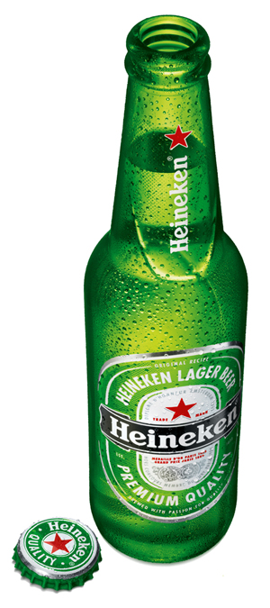
On December 1, Heineken announced the global roll-out of the new iconic Heineken bottle, completing the redesign of its global brand packaging range. The restyling aims to streamline the visual identity and make the brand even more consistent and recognizable in all 170 markets worldwide. The new bottle will come in five different volume sizes and will be available in Western Europe at the beginning of 2011 and across the rest of the world by 2012.
The Heineken brand’s redesign project was led by a cross functional team consisting of global marketing, supply chain and the participation of a number of markets. It ensured the smooth transition from fifteen to five bottles sizes.
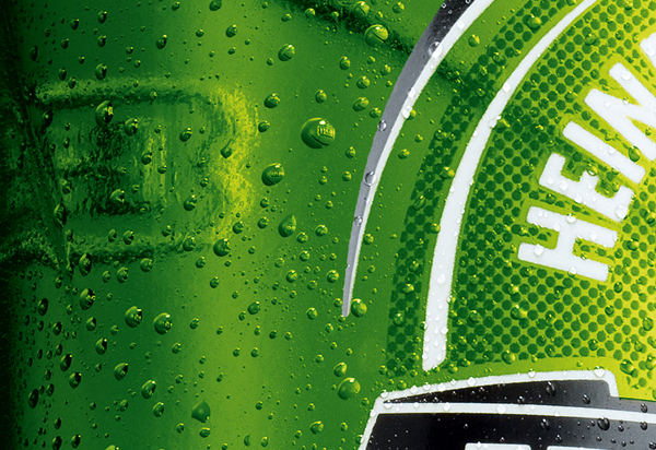
The new bottle, replacing the XLN (extra long neck) and Heineken shortneck packaging, is introduced in two versions: embossed and standard. The new design features a unique curved embossment on the neck and back, which not only looks good, but also adds a pleasing to-the-touch feel, whilst a distinctive embossed mark acts as a stamp of quality and authenticity.
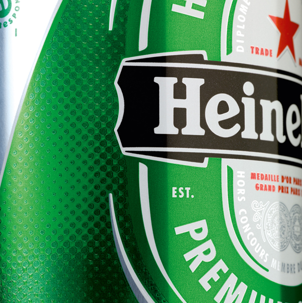
In addition to the specific packaging changes, the new packaging visual identity includes updates to key brand elements including an ellipse curve, derived from Heineken’s iconic racetrack logo. Additionally, Heineken’s trademark refreshing green colour has been enriched and its iconic red star emblem, the world’s most recognizable beer symbol, has been raised above its logo.
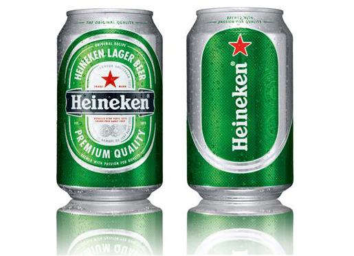
The new bottle reinforces the visual identity packaging that is already in use on cans and glasses introduced in the beginning of 2010. The progressive packaging introduces sensory elements such as embossments, strategically placed indents and tactile ink, offering consumers aesthetic improvements, adding to the overall drinking experience.
Heineken’s commitment to innovation is evident in the new can design which is the first of its kind to feature tactile ink and be introduced across the world. This revolutionary ink, created by a series of small raised dots on the surface of the can, gives the consumer a better feeling in the hand, enhanced grip and allows the brand to appear more refreshing and recognizable.


