Oxy is one of the most important Italian Brands of hair removal products, leader in the superfluous hair bleaching segment. With 25 years experience in the market, the Brand is perceived as effective and gentle, and now was the right time to change package design, while paying a tribute to the heritage.
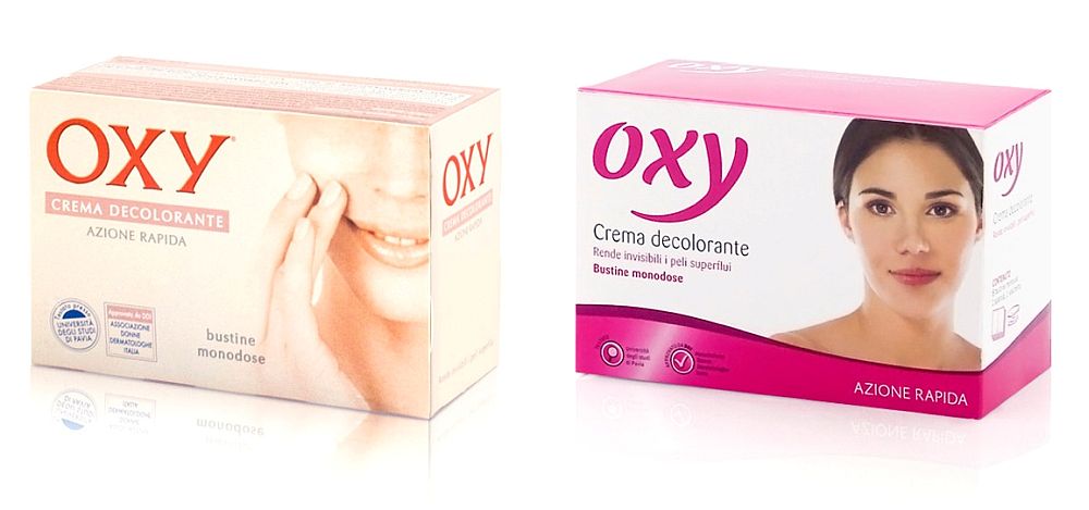
The current pack’s soft colours communicate the concepts of care and delicateness. This focuses perception too much on “reassurance” to the detriment of other concepts fundamental to the product category: effectiveness, professionalism, guaranteed results and innovation. Furthermore, it was observed that the pack lacks shelf impact; the most common remark about the packs is that they “disappear”.
Oxy: new packaging
The Italian firm CB’a Design Solutions helped the brand re-define itself as a category leader and enhance its positions.
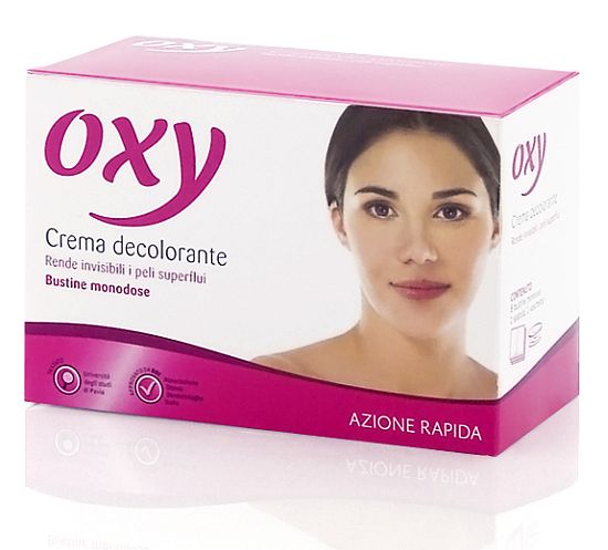
The redesigned OXY logtype is more modern and glamourous. The Brand’s red has been toned down to a magenta, which is both more attractive and in line with colour codes typical of the sector.
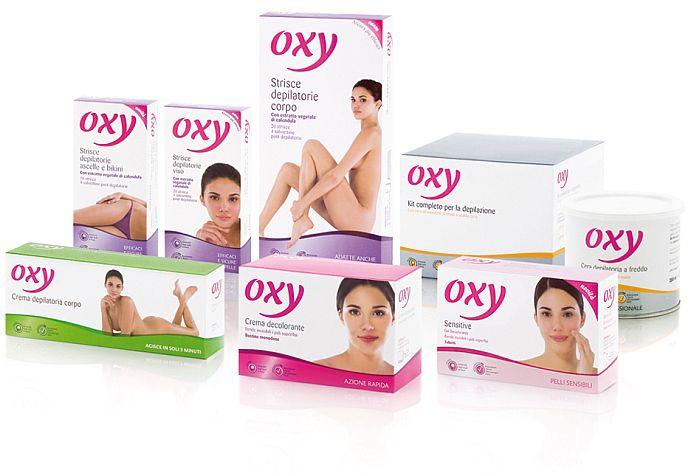
The product categories are segmented using waves of different colours. These help the consumer to choose, and provide the products themselves with considerable shelf impact. In this sector, it is extremely unusual to use a female figure as key visual. However, in keeping with the history of OXY, this approach has been maintained. Finally, thorough infodesign work ensures that the side of pack and instructions are an efficient communication tool and source of customer loyalty.
A logical consequence of the definition of a new Brand image and pack system was restyling the website.


