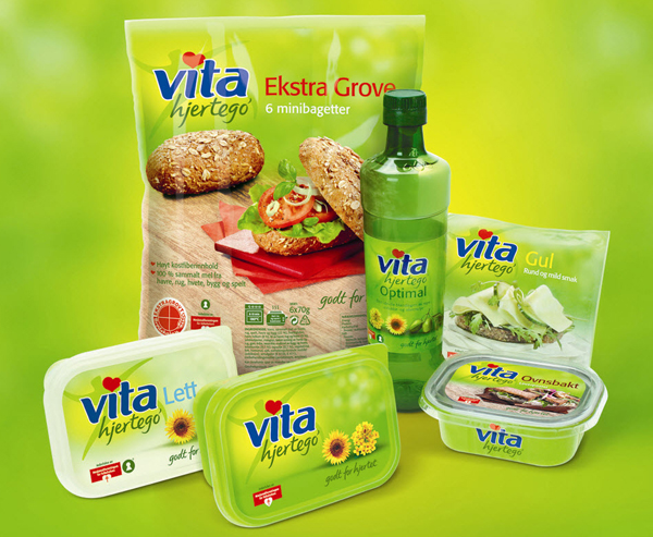
Norwegian healthy eating brand Vita hjertego’ is re-launching with a new look created by European brand consultancy LFH. The new design strategy will be applied across the entire Vita hjertego’ portfolio, which includes pate, mayonnaise, oil, cheese and bread.
This is the first time that the entire brand has been overhauled since LFH created the original design. The objective is to re-invigorate sales growth by appealing to a broader range of health conscious consumers who enjoy life and live an active lifestyle.
The new design is fresh, modern, contemporary, and clean with less clutter and communication icons which retains the key equities of the brand. Vita hjertego’ everyman’s figure, which is much loved by consumers, has been updated and shaped into a healthier green man. The Vita hjertego’ type has been refreshed, and hjertego’ now has a hand lettered script which is more open and approachable.
The brand’s core colour, green has been updated to give it a more ‘foodie’ feel, and to emphasize taste. Imagery now plays a much greater role in the design on relevant products, beautiful photography and serving suggestions have been used, and core products like margarine and oil use photo realistic illustrations of the key ingredients i.e. rapeseed and sunflowers.
Steve Irvine, LFH’s creative director says, “With changes to consumer behaviour we needed to develop a new design strategy which would communicate taste more strongly and create a brand architecture that allows for clearer segmentation and communication. We recognised that health continues to be a key driver for the brand and have balanced this core value to make it a more friendly, open and approachable brand with a broader appeal. The new design is fresh, modern, contemporary, and clean with clear messaging whilst retaining key brand equities.”
