Following its launch back in January 2010 Maxitone, the lifestyle protein brand for active women, is redesigning its packaging.
Inspiration behind the new design comes from a brief to add energy and movement into the pack. Consumer research groups revealed a clear need for protein products to appeal to and inspire more women in an environment where protein is often misperceived as a male prerogative.
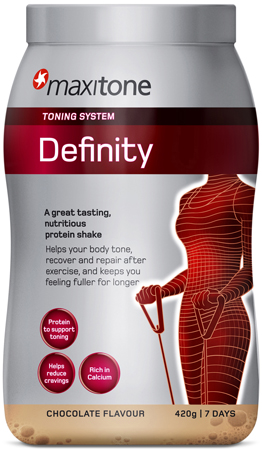
Photo: Maxitone Existing Design
Bloom was the appointed brand agency. ‘We have designed a pack that strikes a careful balance. Feminine, but not girly. Effective, but not medicinal. Dynamic, but not aggressive”, says Bloom’s Planning Director, Ed Hayes. “The main challenge was to compensate for the audience’s preconceptions that these kinds of products are traditionally for building body mass, not for toning, weight loss or general well-being.”
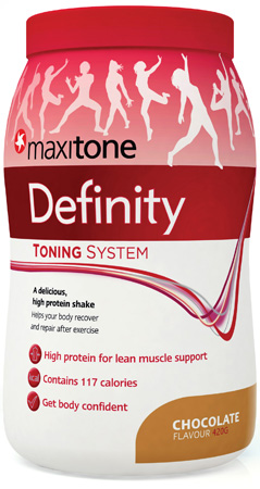
Photo: Maxitone New Design
The new packaging encapsulates Maxitone’s core values whilst balancing female language and colloquial terms with beautiful imagery. Senior Brand Manager for Maxitone, Kate Wells says, “The two core objectives were to make the packaging more feminine and more eye catching for women, especially in a male environment. The new packaging represents Maxitone and reflects the Maxitone consumer perfectly. It’s vibrant, energetic, colourful and beautiful.”

