Each year, more than 30 thousand different new products appear on store shelves around the world. More than 80% of all new products remain invisible to the average consumer. The desire of each company to create a package that will be easily distinguished from other competitors. Today, beverage and food brands have simple, bold colors, large fonts, and chain names.
Food and beverage production is largely determined by trends and consumer demand. Today, the customer is willing to pay extra for environmentally friendly packaging. The consumer wants to make his responsible and useful choice regarding products that he likes. Still, paper and cardboard materials are the main sources of packaging waste, followed by plastic and glass.

KFC is committed to a 100% purchase of paper packaging for all of its products by 2020. Already today, except drinks and desserts, most of the packaging of the fast-food chain intended for take-away food as well as for the home consumer is made on a paper basis. The company uses all cutlery made from sugarcane and bamboo, instead of petroleum-based materials.

The producer of fruit bars Fresh Pick followed a similar strategy. Brand refused disposable plastic packaging and provided biodegradable packaging.
According to a recent study, 38% of buyers are immediately ready to purchase a product with clear information about what is inside. Hence the trend for openness on the part of manufacturers. More and more often on packages, you can see a listing of all the ingredients.
Some companies go even further and use transparent packaging in their production. Thus, the consumer can see what he will eat today. On each package of breakfast bars and cereals from Bianova, contained a list of all the ingredients. Prepared by baking using natural sunflower oil, all the ingredients of the product retain their beneficial qualities.
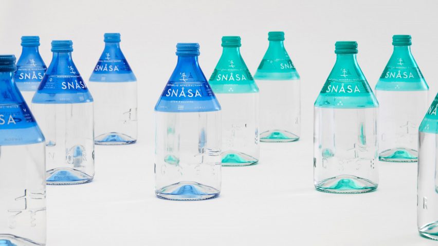
In 2019, the Norwegian mineral water Snasa updated its design. According to the creators, the new glass bottles were supposed to show the connection between the buyer and the Norwegian culture of the indigenous peoples. Transparent bottles with a minimalist design discard all unnecessary and reveal the idea of clean water.
English chain grocery store Waitrose has unusually played with the packaging of its vegetables. Here, the effective slogan is adjacent to the capital letters of the name of each product. English tabloid-style typography shows how packaging can be vibrant and complement any meal.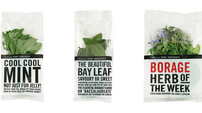
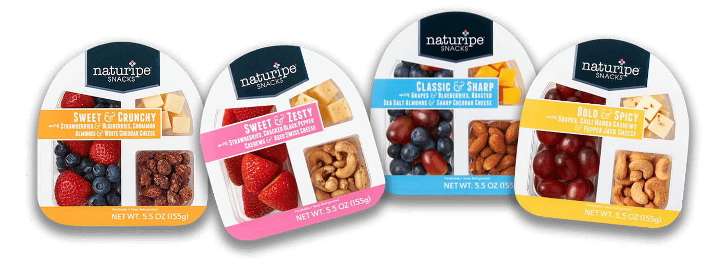
With globalization, accelerated pace of life, the consumer is in search of an easily portable product. Now companies like Bolthouse use portable packaging to sell carrots as one kind of snack. Fruit producers from Naturipe Farms went even further. According to the creators, the new packaging reflects the desire of the consumer to find balanced snacks. Similar sets were available immediately in 5 combinations.
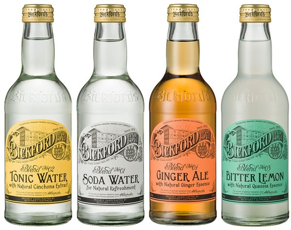
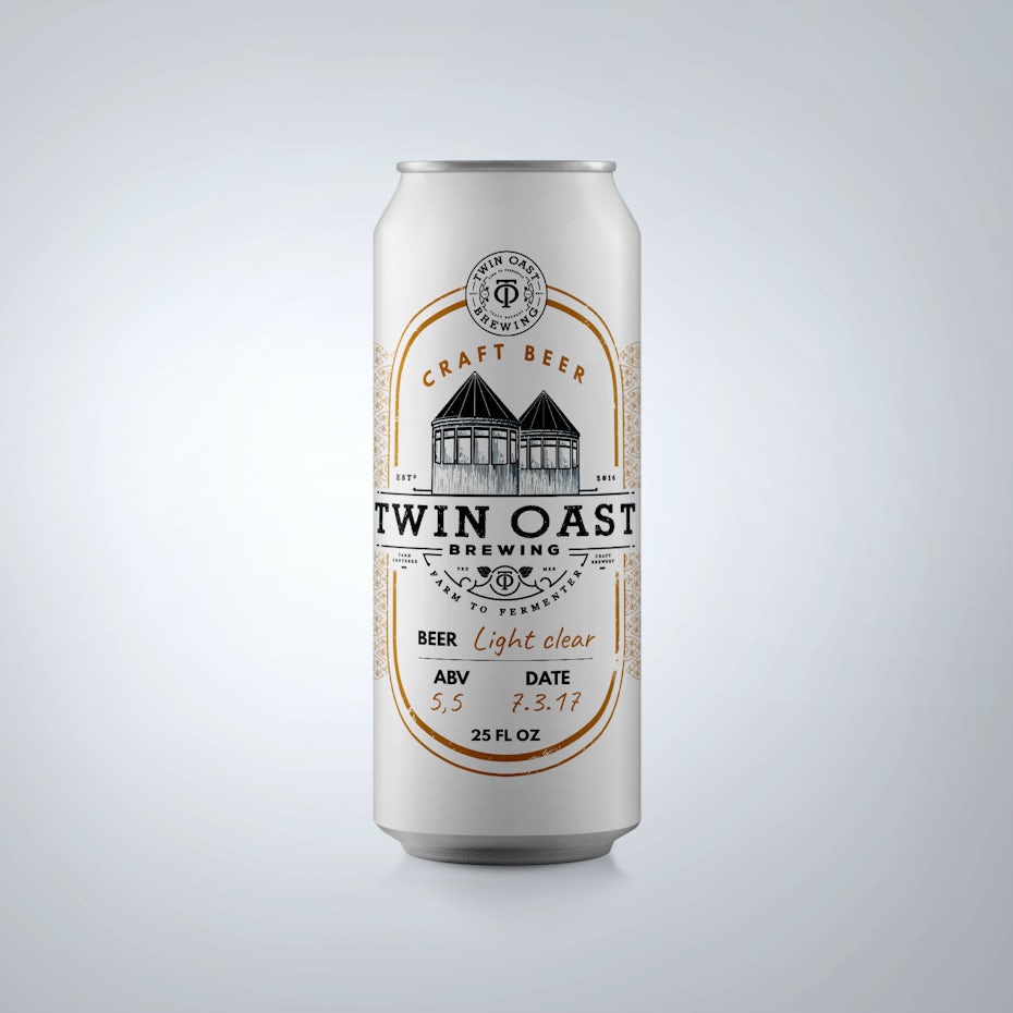
The new product packaging can also create an emotional response. It is not surprising that the topic of nostalgia is increasingly flashed on the packaging. Vintage design works not only for the older generation but also for millennials who are interested in experiencing the past era. One such example was French ice cream «Van Leeuwen». Elements of text and packaging design refer to the product 50x-60x. The classic visual concept reflects the simplicity and purity of the ingredients. In the first year since the redesign of packaging, retail sales grew by 50 percent.
Authenticity is a prime example of how Vintage design is working. In addition to using vintage fonts, we see more and more illustrations, handwritten letters or color patterns in a retro style that conveys a sense of age and family tree.
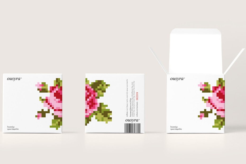
If the vintage design takes us 80-100 years ago, then many managed to catch the fashion for 8-bit games in life. Such graphics occupy a unique place in our creation because, on the one hand, such games have become an eternal classic (Super Mario, Zelda, and others), and connect different generations.
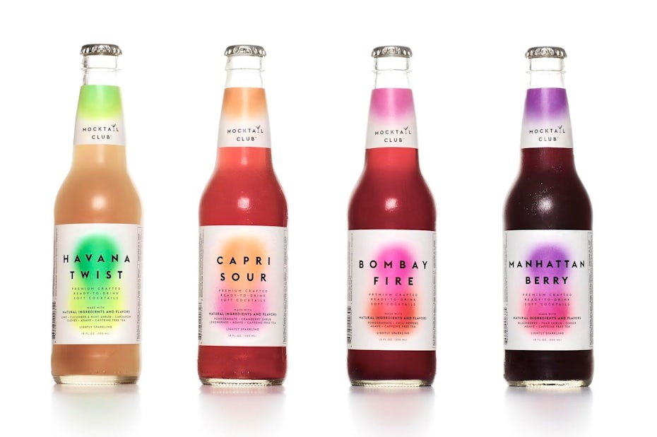
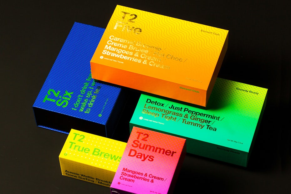
Experiments with a color gradient continue. Gradients offer packaging designers to create something truly new and fresh. It is these color elements that are immediately noted in the human mind. The technology giants Apple and Microsoft have already managed to support the fashion for such color elements.
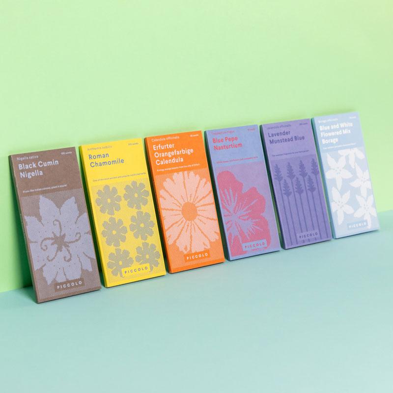
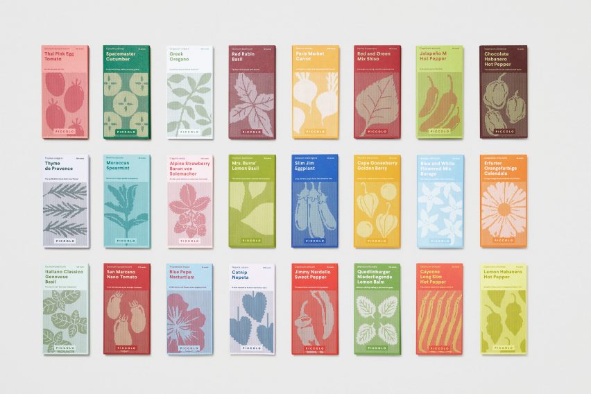
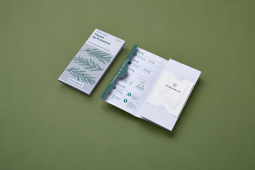
Sometimes a packaging design can tell its own unexpected story. Agency «Here Design» presented a transformative version of seeds packing. All the seeds divided into different color groups. On the backside of every pack, there is a special instruction that describes how to grow every corp. The company deliberately updated its image to connect with a younger, modern and urban audience.
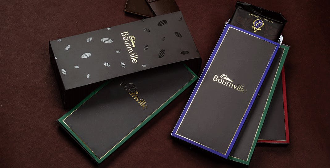
New premium packaging can boost the public image of any product. Such an image includes strict elite colors and the absence of unnecessary details. Gold and black colors are prevailing in this design.
Stylized packaging design plays an integral role in the identity of each brand. New packaging design trends are greatly influenced by the need for clean, convenient and sustainable solutions. A successful commercial company needs to adopt a similar strategy for its brands.
