Unilever unveils two new designs developed by the prestigious Argentinean agency, Pierini Partners, for Rexona, one of most popular products on the global antiperspirant market. The visualities for the brand’s new lines, Rexona Teens Music Fun and Rexona Adventures, encompass the spirit of active life and young generation with their vibrant palette and smart graphics.
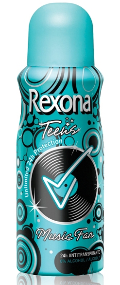
The studio chose an informal and relaxed image for the first project, Rexona Teens Music Fun. One of its main characteristics is the chromatic palette, including intense turquoise, black, and metalized light-blue. These were selected for a double purpose; on one hand, to mark a difference between this new variety and the other launchings of the brand, and on the other hand, to create an attractive and bright visual effect, which matches the joy and magic teens experience when they enjoy their music.
As to the first design, Adrián Pierini, the agency’s CEO commented, “The aesthetic is based on a texture made of concentric circles arranged in a recreational way, on which the identifier icon of the brand is applied: the tic. This element is reinforced in an emotional way, through its integration with the simplified image of a vinyl record. This composition was chosen, because it had very positive connotations, including the retro imaginary and the adrenaline and emotion of electronic music.”
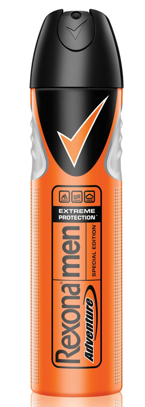
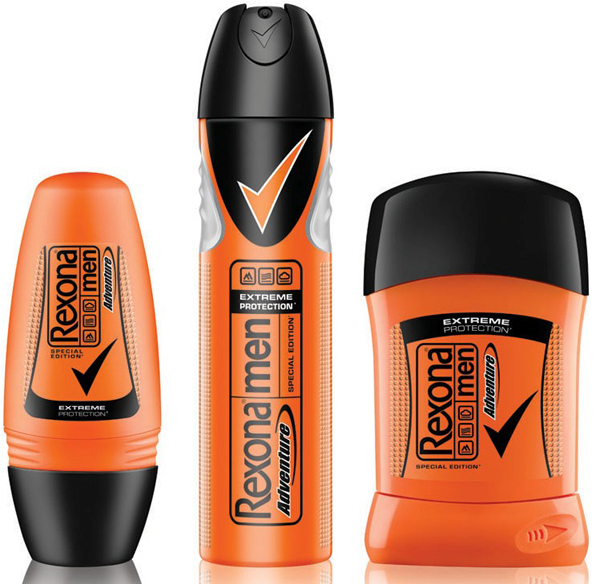
The second design, Rexona Adventure, reflects in a clear way the men desire of over-demand as a reaffirmation of his male condition, and it reaches, through its shapes, typography and colors, to a magnificent interpretation of that aspirational world. The imagery created by the whole proposal (campaign and packaging), offers consumers the possibility of moving with their minds to new horizons and of living an unexpected and unique adventure, going away from daily routine.


