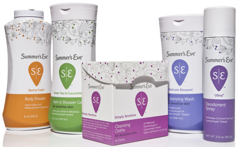
Summer’s Eve has undergone a full-force revolution, making the brand relevant to women again and challenging stigmas of the fem-hy category. At the forefront of the overhaul is new packaging designed by Little Big Brands.Little Big began laying the groundwork for the redesign by talking with women about feminine hygiene through one-on-one interviews to learn more about their views on the category, and perceptions of the Summer’s Eve brand. Consumer insights were key to redesign, with nearly 3,000 women weighing in on the process through ethnographies, focus groups and quantitative studies.
“We took a step back and began by developing a differentiated, ownable vision for Summer’s Eve,” said Pamela Long, director/client services for Little Big. “While the category is problem/solution, women view the brand as part of a healthy routine. The old packaging worked against this, appearing dated and matronly.”
The Summer’s Eve identity was completely overhauled and given an upright script that lives understated on the top of the package. More prominent is the Yoni symbol which holds an S and E. The Yoni is an ancient symbol of female genitalia. The custom illustration lends a contemporary, feminine appeal, while the bottom of pack boldly color codes flavor, locking up product type and claims.
Product Ventures spearheaded new structural development for the Summer’s Eve wash, powder, spray and wipes packages. The final structures were based on their consumer-driven research of macro trends in the marketplace, digital ethnography findings and consumer guided structural visual imagery.
Key to the success of the project was the backend production work—addressing all elements across multiple substrates and print processes. The updated brand spans 5 product forms, 6 product types, 32 SKUs and 17 flavor colors.
Summer’s Eve is hitting store shelves now. The packaging is being supported by a full-scale marketing campaign, including TV, print and online media.
