Lipton Ice Tea is going through a global rebrand to become even better associated with natural revitalisation and wellbeing.
The new look and communications campaign will roll out in major international markets except the U.S. The aim of the project was to better communicate a healthier choice of refreshment with the natural and uplifting qualities of tea that Lipton Ice tea offered comparing to carbonated soft drinks.
All the creative work for the relaunch including the development of branding, visual equities, packaging graphic design and bottle structure, as well as key visuals for the communications campaign have been created by Design Bridge.
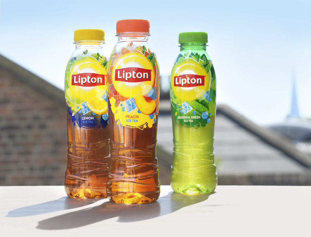
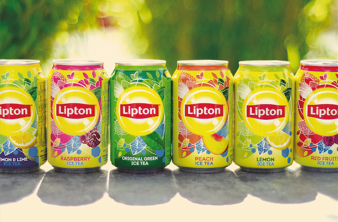
The new on-pack graphics and illustrations strongly associate Lipton Ice Tea with sun, waves and beach culture. Another noticeable change is the removal of the words ‘Ice Tea’ from the label, leaving simply ‘Lipton’.
Andy Jordan, Global Strategy & Innovation Director on Lipton Ice Tea commented on the rebrand:
“The new Lipton Ice Tea bottle achieves high shelf impact thanks to a distinctive modern unisex profile, and engaging physical equity in the form of a cartouche echoing the iconic Lipton motif.
The bottle provides a great in-hand feel prompting consumer excitement and enjoyment. Another key development is the new ‘shoulder-high’ label, working in combination with the new graphics design to prompt recognition and provide high visual disruption and differentiation on shelf.
The higher-positioned label also seeks to arouse that same sense of ‘uplift’ consumers get from drinking Lipton Ice Tea.”
The relaunch will be supported with outdoor and in-store communications across billboards and bus shelters, as well as posters, banners and wobblers at point of sale.