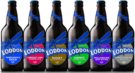
Oxfordshire-based brewery Loddon has been completely rebranded by brand and packaging design consultancy We Are Pure. We Are Pure has created fresh new concepts for Loddon’s range of five core beers, as well a monthly special beer. The consultancy, which has been working on the project for three months, has also created new marketing material, including beer mats, runners, pump clips and glasses, as the family-run brewery looks to increase its market share.
Photo: The new visual concept for Loddon, developed by We Are Pure
Loddon’s new branding places greater emphasis on the distinct dragonfly logo and blue colouring, which pay tribute to the brewery’s name, derived from the River Loddon. The logo is now much larger, with the dragonfly also featuring on the neck of the bottle. New typeface has also been created to give the brand a more simplistic, modern feel.
“The brewery has an incredibly loyal customer base and whilst we were aiming to appeal to a new audience, we also didn’t want to alienate existing consumers. This is the first time we’ve rebranded a beer range, and I think that has worked to our advantage. We were able to draw on our experience in other sectors and avoid market stereotypes. The result is a concept that seamlessly blends the old and new and will hopefully take Loddon to a whole new level,” commented David Rogers, owner and creative partner, We Are Pure.
