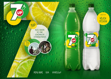
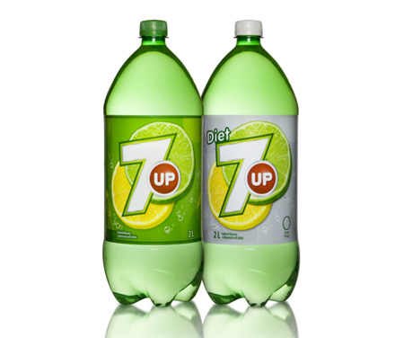
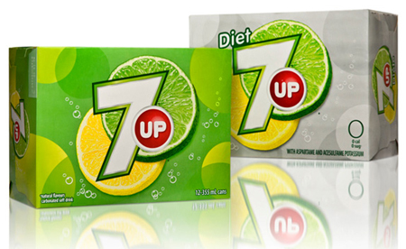
7UP becomes simpler—not in terms of the recipe, but visually. The citrus flavoured soda brand decided to drop some elements of its previous logo and make it look bolder and fresher. The new identity developed by TracyLocke new York was launched only in international markets, where the 7UP brand is owned by PepsiCo (not the U.S., where the 7UP brand belongs to the portfolio of Dr Pepper Snapple Group, Inc.). The countries, which have got the famous refreshing drink in ‘a new outfit’ several months ago, are Germany and Canada.
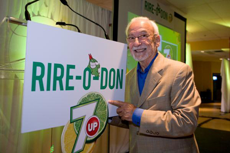
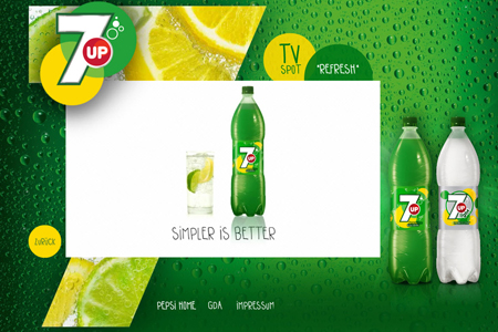
The redesigned bottles are featured on the brand’s German website (alongside new tagline ‘Simpler Is Better’) and in its promotional materials within the 7UP Rire-O-Don campaign, launched in summer 2010 across the county (still, 7UP’s Canadian website features the old version of the logo). The new design features lettering with straight lines instead of curvy ones, preserves the iconic faux bubbles and Jupiter-sized slices of citrus, and is mirroring the nature of the drink—brisk and full of refreshing taste. The word ‘UP’ is now pushed into the red dot.
In June 2010, on its YouTube page the 7Up Canada released two commercials about the simpler ways of refreshment. The tongue-in-cheek spots, titled ‘Love Story’ and ‘Refreshing Machine,’ are dedicated to highlighting much less complicated methods to bring fresh tones into your life.
Illustration: wwww.underconsideration.com
Illustration: wwww.underconsideration.com
