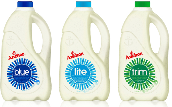
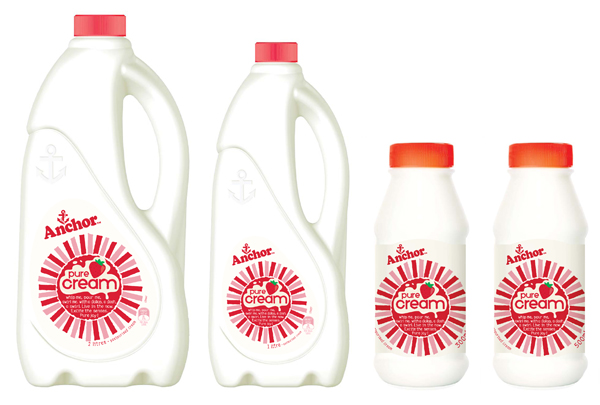
Anchor, the iconic New Zealand milk and dairy brand, has a fresh new look at the hands of brand design expert, Dow Design. The new Anchor range—now in store—has been given a vibrant, upbeat feel through a modern and fresh package design that sees brightly coloured suns appear across the range.
“Our aim was to find a simple and powerful visualisation of freshness, to represent the modern dynamism of Anchor,” says Dow Design Creative Director, Donna McCort. “We were inspired by the sun, because it helps grow the grass that feeds the cows, and it’s a happy, universal, dynamic symbol. The Anchor sun is bold and strong but its hand-drawn feel gives it a warmth and humanity.”
In the wake of an increase in competition based purely on price, Dow Design wanted to reinvigorate the Anchor brand and its values, taking it from a commodity back to the trusted brand that generations of New Zealanders grew up with. To help achieve this emotive link, short stories that capture joyful moments of everyday life, reminiscent of the Anchor family ads, appear on the packaging.
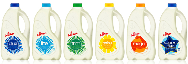
The Anchor logo, long seen as a seal of quality and approval, has only changed slightly on the new packaging, now appearing at a slight angle. Another element that hasn’t changed is the variant colours; blue still representing original standard milk, light blue for ‘lite’ and green for ‘trim’.
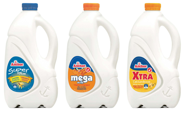
Image: The previous version of packaging
Dow Design distinguished Anchor’s enriched milks range by applying individual symbols to represent their unique offering while matching the straight-forward, modern personality of the brand’s sun symbol. Bottles of ‘calci+’ boast a sunflower; a flexed arm muscle appears on ‘mega’ and a ‘star’ on ‘super blue’. Anchor’s new branding appears on bottles of fresh milk and cream now available in supermarkets, dairies and convenience stores nationwide. In November, the brand’s tetra milk cartons, milk powders and UHT long life milks will also be rebranded with the new design.


