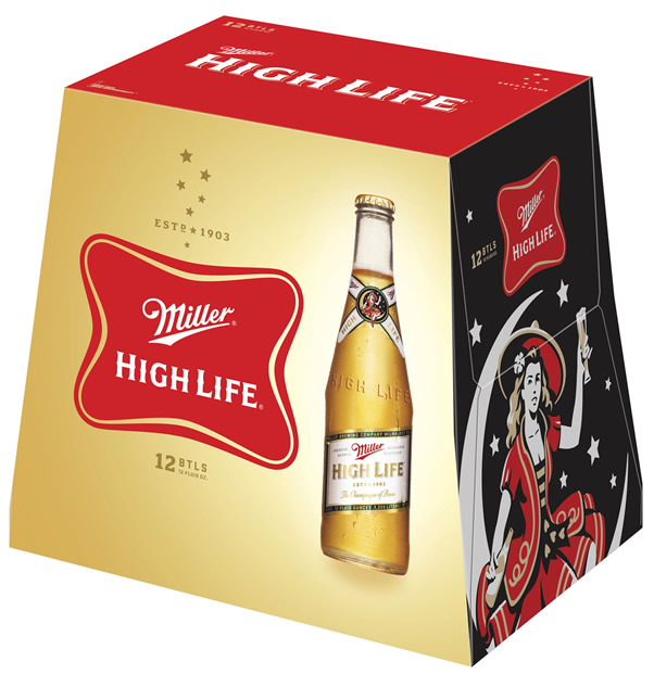
Miller High Life brought a new look to store shelves last month with the debut of new primary and secondary packaging across all bottle and can offerings. The new packaging for Miller High Life and Miller High Life Light features a cleaner, more streamlined look, while maintaining the timeless Miller Soft Cross logo, «Girl in the Moon» imagery and «Champagne of Beers» callout that have represented the brand for more than 100 years.
«We’re proud of our reputation as an authentic and unpretentious beer and are continuing to reflect that in our packaging,» said Miller High Life Brand Manager Joe Abegg. «We aren’t adding any new bells and whistles; we’re simply bringing a consistent brand character to the entire Miller High Life family with a cleaner, crisper look we believe our consumers will appreciate.»
Although «living the high life» may look a little different on the outside, consumers will still find the same high quality beer on the inside — completely unchanged — highlighted by the clear, iconic Miller High Life bottle.
