Seed and Bean, the UK’s most ethical chocolate brand, as voted by the Good Shopper Guide in 2012-2013, relaunches with a bright and eye-catching look that mirrors the label’s “magic, creativity and passionate personality.” The rebranding has been carried out by Family (and friends), which has developed the new design along with the new message of the chocolate brand with an organic and Fairtrade background.
The new visual language is more vibrant, highlighting unique and exciting flavor combinations of the product. The new warmer palette and design approach will appeal to younger consumers much more effectively than the previous minimalistic and conservative version.
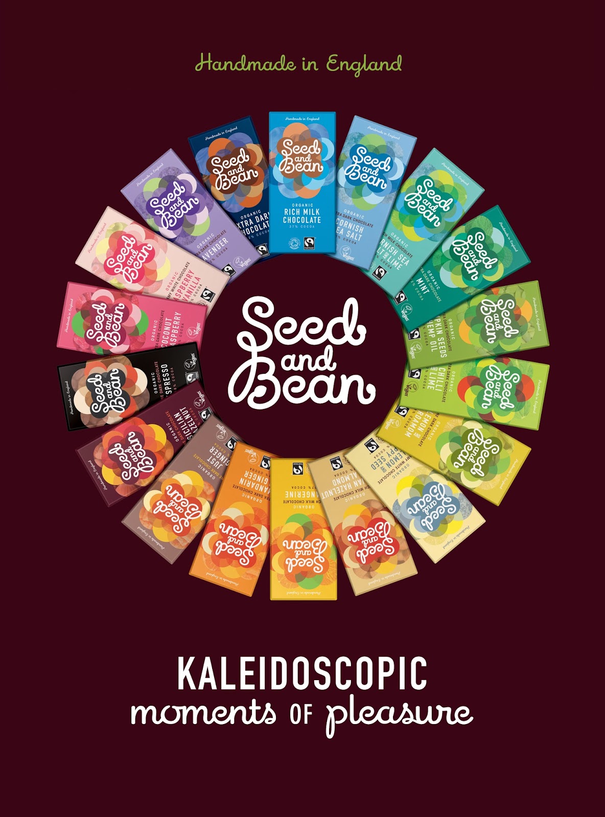
The updated logo features stems, shoots and buds as a tribute to the brand’s organic credentials. The all three words in the brand’s name are spelled—the previous ampersand is omitted.
The strapline, Kaleidoscopic Moments of Pleasure, syncs with the wavy graphics of different color for each of the multiple taste combinations. Additionally, now it’s easier to see the chocolate’s hierarchy—extra dark, rich milk, etc.
“It was a perfect brief for us—a product with such good qualities and brand owners with such passion, but with packaging that lacked the visual and verbal tools to be its best salesperson. Our job is to get people to really take notice of Seed and Bean; to get them to understand the brand’s special difference at point of purchase,” commented Alex Durbridge, creative director at Family (and friends).
The Seed and Bean’s new packaging will arrive in the UK and Europe from February.