Here are the five redesign projects for big brands released over the past week.
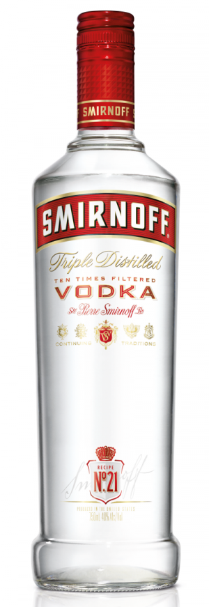
1. Smirnoff Vodka has got «more contemporary» bottle and label featuring new typefaces. The project was done by Design Bridge.
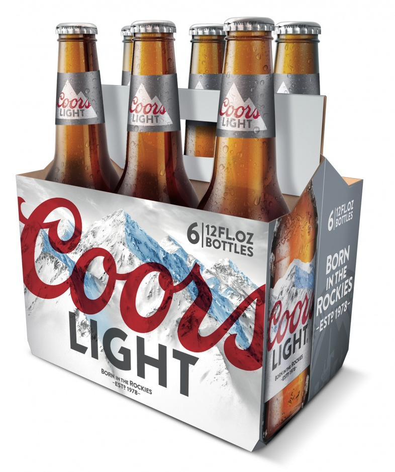
2. The U.S. beer Coors Light, a brand of MillerCoors, has been rebranded and given a new »emotional positioning’ conveyed though bigger, bolder imagery that also reflects the new positioning «Born in Rockies». The redesign was developed by Turner Duckworth.
3. The Chinese technology giant Lenovo has updated its wordmark that features a capital letter «L» instead of the lower-case. The new logo is «not a traditional and static», the company’s CMO comments. «It’s not rigid, it’s not linear and it’s not fixed.»
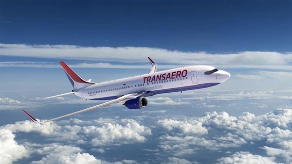
4. The Russian airline Transaero has unveiled the new corporate identity developed by StartJG. The new capitalized wordmark written in both Cyrillic and Latin typefaces, reflects the «positive change» and «a new chapter in the company’s history.»
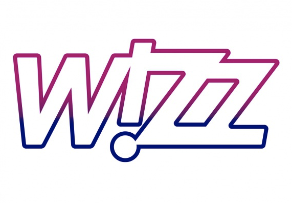
5. Another Eastern European airline, the Hungarian Wizz Air, has refreshed the brand identity with the help of FutureBrand. The pink-cobalt vibrant wordmark reflects «the forward-thinking attitude of the brand».