Following a three-way pitch in late 2009 Pearlfisher was appointed to the Yeo Valley business and tasked with the rebranding and redesign of the entire range of approximately 100 SKUs. The new identity and first wave packaging has just launched.
Yeo Valley is a family owned farming and dairy business based in Somerset. Its founders Roger and Mary Mead began making yogurts, using milk from their dairy herd, in 1974 and selling them to local shops. To this day the farm is a fully sustainable operation, where every part of the process involved in getting the product onto the shelf is considered.
Pearlfisher’s initial work was to create a new brand identity that reflected a progression for the brand to ensure that it moved forward with a positioning that focussed Yeo Valley’s ownership of dairy. Although successful over the last decade, becoming the number one organic dairy brand, Yeo Valley recognized the need to reaffirm their positioning as a mainstream, more accessible dairy brand.
The new identity encapsulates the Yeo Valley name within a milk droplet — representing Yeo Valley as an emerging icon within the world of dairy — the vast majority of Yeo Valley’s products being milk based. The typography for the brand name has been softened to give a friendlier feel, whilst retaining a contemporary edge with clean lines and simplicity. The type colour has remained green.
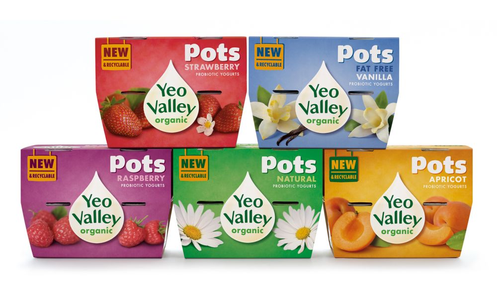
The graphic design on the pots was inspired by Yeo Valley’s core values of simple, original and progressive and the tone of voice of the copy has been designed to be frank and focussed to reflect the fresh thinking of this much loved brand. The photography of the fruit within all pots (and across the range) has been shot to create a rich depth to the image and the product — again retaining immediate accessibility and warmth.
Ben Cull for Yeo Valley comments, «Yeo Valley appointed Pearlfisher at a key moment in our growth. They have surpassed our expectations and created a graphic system that works over the entire portfolio — held together by a meaningful and relevant new brand identity — we’re thrilled with the results.»
Jonathan Ford, Pearlfisher Creative Partner comments, «Yeo Valley is a dream brand — it has heritage, depth, believability and the promise of being a true icon of the future. We loved this project and the commitment of the client to create something truly different — to be brave and bold by standing for something ie dairy.»
Yeo Valley Pots launched in June with roll out of the rest of the portfolio being planned for September 2010.

