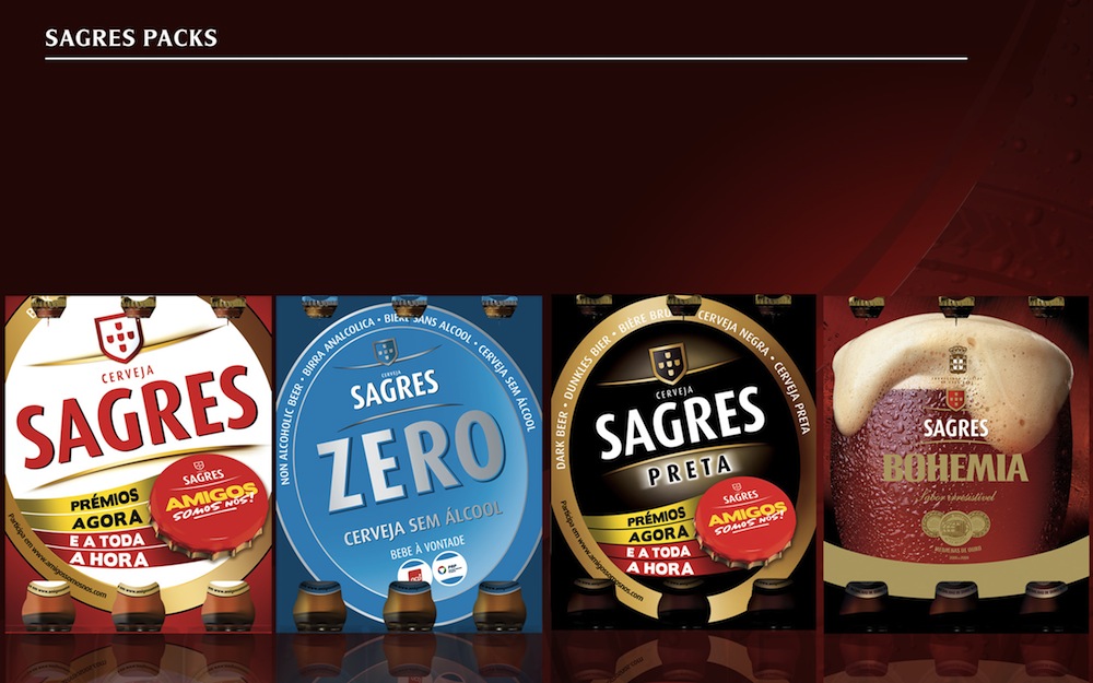
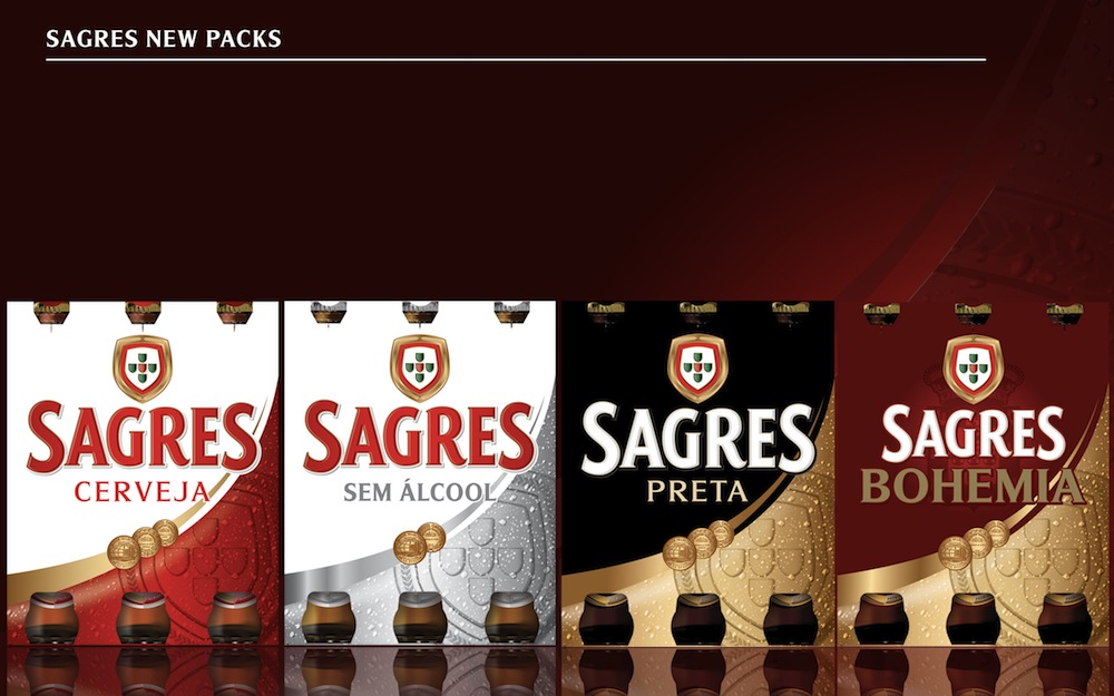
Within the tightly formed battleground of the Portugese beer market, the Sagres brand had not been evolved to its fullest potential, and on-shelf the brand’s erosion of quality and national pride was a threat to one of Portugal’s most iconic beers. Could beer brand experts Claessens International give Sagres back its national pride and rebuild its emotional bond with consumers?
Background
From its birth in Lisbon in 1940, the Sagres beer brand has been inextricably linked to its home country Portugal. A proud beer for a proud nation, the brand developed its specific character around the emblem of the country, the passion of its people and the quality of its offering. From the Forties to the Noughties, Sagres carefully developed its brand, maintaining its core values of authenticity and quality to retain its emotional connection with the Portuguese people, while representing the essence of Portugal in its export markets.
Keen to continue to move forward and maintain its relevance in the 21st century, 2007 saw the Sagres brand go through a process of modernisation. The rebranding process succeeded in giving the beer a more contemporary image by removing or suppressing many of its brand elements in order to create a minimal, cleaner look and feel. This combined with the erosion of its Portugese iconography, reduced the emotional bond with the consumer and created a low-quality uncared-for presentation. However, it wasn’t long before the company realised it had gone too far, and in 2011 they turned to beer brand experts Claessens International for help.
“The modernisation stripped out a lot of the key brand assets and important beer credentials, the brand lost much of its emotion, and it had begun to look cheap on shelf,” recalls James Boulton, creative and managing director of Claessens International. “For example, in the name of minimalism, the Portuguese emblem on the label lost much of its detail and colour, becoming a mere token symbol. This had the effect of reducing its links to Portugal and consequently watered down the beer’s national pride – a cornerstone of the brand.”
Strategy
Claessens’ aim was to give the brand back its pride and re-establish it as the beer of Portugal in order to reconnect with consumers and stand out within an increasingly crowded market, Sagres needed to become a dynamic contemporary brand in Portugal.
“Sagres represents the emotions of the Portuguese nation,” says Boulton. “For years the brand had prominently displayed the Portuguese coat of arms, reinforcing its position as an icon of the country, and the brand development had to reestablish this. It was essential that Sagres used all its assets of authenticity, emotion and charisma, in order to create a tight bond with the consumer and become part of their lifestyle.”
First, Claessens’ embarked on an extensive and comprehensive exploration of the Sagres brand and how it should be presented for maximum audience engagement.
The 2007 modernisation had tried to give Sagres a more up-to-date image, key brand assets had been jettisoned reducing the beer’s differentiation in the marketplace and the impression of quality. For example, the Portuguese emblem had become unrecognisable, while a lack of visual detail and beer credentials on the label, along with the addition of promotional adverts, had cheapened the product. The ultimate result was the opposite of premium, lowering price expectations and confusing the consumer.
“Essentially the brand had been deconstructed,” explains Boulton. “So we needed to take Sagres on a journey of re-discovery – rediscovering its national pride; rediscovering its connection with the consumer; rediscovering its emotion and building a quality image for the brand.”
Claessens looked in depth at the evolution and development of the Sagres assets, investigating where it could add more quality, and exploring Portugal to discover how to make the coat of arms emblem more authentic, emotional and yet at the same time cutting-edge and contemporary. The company also looked at brand standout, aiming to give the label more impact and dynamism. Then Claessens started to re-build the brand.
“On reconstructing the brand, we built in all the missing elements that were key to establishing national pride, connection with the consumer, emotion, the beer’s credentials and premium quality,” explains Boulton.
Results
Through Claessens’ skill, subtlety and care the Sagres brand began to bloom again. The exquisite touches included the border of the oval front label being given more depth and dynamism through the use of careful shading, while gold flashes were introduced to create movement and a premium feel. Meanwhile, the Portuguese colours were added to a richer looking emblem, re-connecting the beer to its Portuguese roots, while emphasising quality. Even the label’s ‘wings’, which display the mandatory product minutiae, were given a watermark of the Sagres logo to create depth. The new look and feel was completed with a fully redrawn logo to strengthen and invigorate the brand’s character. The result was full of Portuguese passion and charisma, bringing the brand back to life with a modern image brimming with emotion.
Beyond its classic beer brand, Sagres offers a number of other products, which highlighted the inconsistency within the brand architecture. These include a low alcohol version, along with a dark beer and ‘bohemian’ offering. Having rebuilt the classic label, Claessens turned its attention to applying the same principles to the entire range, instilling balance, dynamism and national pride to each product, along with a contemporary and uplifting feel. And an icon of Portugal was reborn.
“It’s imperative that a brand has elements that can grow to become valuable assets for the company,” says Boulton. “The more assets a brand has, the richer the story it has to tell. And it’s this story that creates the all-important personality of the brand, which sets it aside from its competitors and connects with the consumer.”


