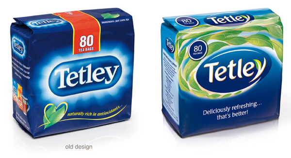
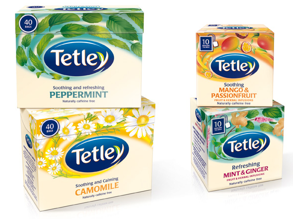
London based brand design consultancy, Ziggurat Brands is in the final stages of a significant two year packaging redesign project for Tetley tea, which concludes with a new brand architecture and unified brand identity that will be introduced to Tetley’s international markets, commencing in September 2010. The first territories in which the new branding will appear are the UK, USA, Australia and India.
In the initial phase of the project, which started in 2008, Ziggurat Brands assessed Tetley’s packaging as it appeared in territories as diverse as Russia, Australia, India and the USA— noting and validating the specific needs, rituals and conventions of the local markets. Some 250 different packs came under scrutiny, representing traditional black tea, green, fruit and herbal, redbush and speciality teas. Research conducted in both the UK and Canada informed the design development and the result is a design that evokes a mood, described as “the better state of mind teas” associated with each different tea moment.
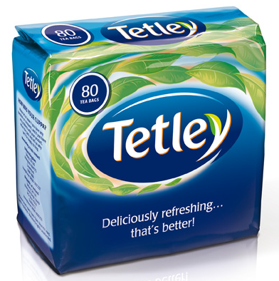
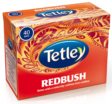
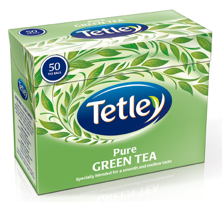
The design takes its lead from the notion that drinking a cup of Tetley changes perceptions—reviving, refreshing, and comforting—and a swirling graphic illustration presents the tea variant in terms of redbush, green, fruit and herbal, speciality and traditional Tetley black teas, swirling around an oval shape framing the revised Tetley logotype. The logotype is instantly recognised as Tetley, but subtle changes in the lettering and modifying the ‘y’ to reference a tea leaf, with an accent green against the signature Tetley blue pull focus to the centre of the pack. The illustration swirls onto the lid of the carton, whilst on the reverse, the blue changes to a refreshing hue cuing the nature of the product. In store, the new packs will have great impact when the Tetley brand is merchandised as a range.
