This year was quite a controversial one for brands, which decided to update their logos and global overall look—well-accepted, slightly noticeable or even completely disastrous. We at Popsop have flipped through the news of 2010 and made up a list of 10 brands which are entering the new year with a revamped brand identity and values.
The ten market players—Google, AT&T, Miller High Life, Gap, Peugeot, Bavaria, Seattle’s Best Coffee, Heineken, MySpace and Olay—caught our attention this year with their revamped visual identity. Most of these experiments were welcomed by consumer world, but some of the attempts to upgrade looked really pathetic.
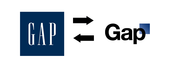
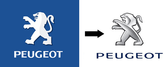
The leaders of the poor rebranding are Gap and Peugeot, which had to resist a rush of public indignation as they unveiled their new logos. While the carmaker managed to protect its silver tongueless bear created by Paris-based BETC Design, Gap decided to surrender and replaced its new logo featuring Helvetica font and the blue square pushed to the upper right corner with the previous much-loved version.
There are also some brands, which didn’t actually introduce any groundbreaking updates—it’s not rebranding in the genuine sense of the word, to us it looks more like retouching. Take a look at these delicate changes:
The most popular search engine, Google, got rid of the shade
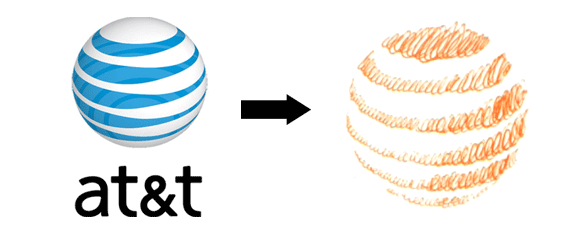
AT&T removed the name of the company, the stripped planet remained unchanged
Olay went monochromic and pushed the face to the right
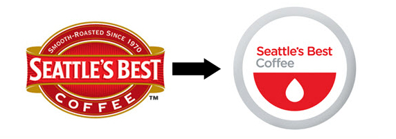
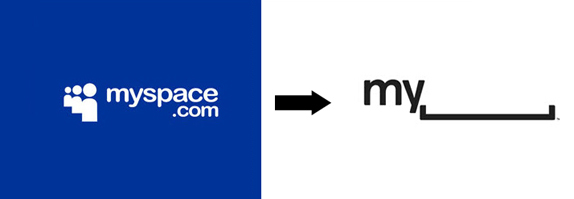
A bunch of other brands did it really huge by stepping from the previous logos as far as possible. The most prominent changes we made by Seattle’s Best Coffee (the logo was designed by ad agency Creature) and MySpace.
The idea behind the concept is simple and clear: if it’s about coffee, there must be a coffee cup and drop, if it’s about digital space, there must come this keyboard symbol as well. Very logical. Moreover, while the coffee brand retained its traditional red colour, MySpace decided to move from blue, the iconic one of its major competitor—Facebook, and turned to black and white.
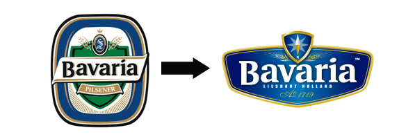
The blue colour was picked as the major element for the updated image of Bavaria. The improved logo in the navy-blue palette featuring a rounded-edge triangle helped develop a unified identity for the brandб which now could differentiate itself from another big player on the market, Heineken.
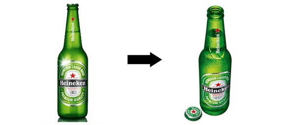
In its turn, Heineken has introduced a tactile packaging featuring a unique curved embossment on the neck and back of its all-green bottles.
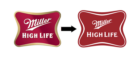
The last but not the least brand in this beer trio as well as on this list is Miller High Life, which redesign created by the San Francisco-based office of Landor is more like the one of Google’s—the shading is gone. On the whole, the logo hasn’t changed much, they just decided to add more cleaned up and distinct.
Other giants including Coca-Cola, Starbucks, Nike, Guinness, Procter and Gamble, Unilever and more remained in their old jackets. Maybe, their logos are already perfect, or they have something in store for the next year?
Image Courtesy: www.underconsideration.com
